Notebook Info

  • Subscribe to our RSS feed.
  • Twitter
  • StumbleUpon
  • Reddit
  • Facebook
  • Digg

Thursday, 4 November 2010

Ink Review: J. Herbin 1670 Ink

Posted on 04:00 by Unknown
Red was your colour.
If not red, then white. But red
Was what you wrapped around you.
Blood-red. Was it blood?
Was it red-ochre, for warming the dead?
Haematite to make immortal
The precious heirloom bones, the family bones.

- Ted Hughes, 'Red'


Karen Doherty, Exaclair's Marketing VP, surprised me with a box last September. It was completely unexpected, and I jumped like a little kid when I saw the 1670 Anniversary ink, a large Rhodia dotPad, and an anise green blank Habana inside the box all swathed in seemingly endless piece of bubble wrap. I felt very lucky to receive a bottle of this ink because it is a limited edition ink, released early this year to specifically commemorate J. Herbin's 340th founding anniversary.

The J. Herbin Anniversary ink is named 1670 after the year the company was founded. It is also called Rouge Hematite for its color, taken after the mineral hematite (blood ore), which is also the Greek word for blood.


I like the unique design and packaging of this ink. Unlike the other J. Herbin inks, the 1670 Anniversary ink arrived in a new bottle inside a new box. The 1670 comes in square 50ml bottles, with 1670 simply embossed on gold wax to tell its name.


The 1670 Anniversary ink's clear square bottle reminds me a lot of Caran d'Ache ink bottles, but the gold string on the bottle's neck caught under the gold sealing wax (which Stephanie of Biffybeans blog wrote as glue gun wax) adds a touch of elegance into its simplicity.


The gold wax on the bottle, according to the J. Herbin website, is "reminiscent of the wax used for the 'grand cru' wines of France," and all gold wax seals on all 1670 ink bottles are handmade. PaperAndCo.com has a video of this process and it's amusing to see how it's being done: the person assigned to this task puts the gold string on the bottle's neck, pumps the glue gun wax onto the gold string and the bottle, stamps the 1670 on the glue gun wax, cuts the gold string to desired length, and does the whole process again. Cool!


The red wax on the ink bottle's cap is made of official wax cherry, and strongly reminds me of the wax used in cheeses, especially the big queso de bola (Edam cheese) we see in supermarkets around Christmas time here, and get either as gifts from friends or as part of our Christmas grocery package. According to the inital set of reviews, the red wax used for the earlier batch of inks was brittle and crumbled easily, but I received a newer version with a more flexible wax. But all the same, I am very careful when I cap and uncap the bottle. I don't want to destroy the beauty of this ink yet. 


This ink's bottle cap is made of aluminum, and I wished they used the usual hard plastic caps. Then again, wax may not stick to the plastic very well, and so they decided to use aluminum.


The 1670's box is another J. Herbin work of wonder. It has been carefully designed to represent the life of J. Herbin, who was a sailor. The ship, anchor and palm tree represent navigation and discovery; while the crown is a reference to the red sealing wax color used in the royal courts of Europe.

-----------------------------------


Rouge Hematite is a unique ink color in the red/orange/brown range, which is my favorite. It has an intense, vibrant, earthy and blood-red color that is reminiscent of the historical J. Herbin logo and the sealing wax used in the royal courts of previous eras.
 
The 1670 ink has the same qualities of J. Herbin inks I have tried in the past. It has smooth flow, good lubrication, shading and of course, excellent color. However, it is very, very saturated compared to other J. Herbin inks.

For a larger photo click here.

I used a Rotring ArtPen with 1.5 italic nib for the calligraphy, and my white Schneider Base with a firm medium nib for my written review. The grid notebook is from Saizen, which took the inking very well. There is no feathering and bleed for both of the pens I used. Notice the difference in color and shading for the two pens.


The poem I wrote using the 1.5 italic nib looks a brighter red, with more evident orange hues.


The text I wrote using the medium nib looks a darker red, though.

-----------------------------------


And now here are some macro shots. I hope the images below captured the gold in the letters I wrote, especially where more ink was placed on paper.  


Below is the 1670 ink in comparison with other red inks: Diamine Poppy Red (dries a bright red), Camel Scarlet Red (dries a pinkish red), Parker Super Quink Red (dries a pale red), J. Herbin Rouge Opera (not a true red, but dries a beautiful rose red), and Diamine Oxblood (a dark, dark blood-red color). The 1670 ink is the stand-out color in the group, its reddish somewhat brownish-earthy-golden color is a winner!


I mentioned earlier that the 1670 ink is a highly saturated ink. This may be a problem among left-hand writers because this property makes it such a slow-drying ink. I used the Base pen on Rhodia paper for this test, and though several factors may have contributed to drying time, the 1670 is undeniably a slow-drying ink to be 'almost dry' at 1 minute 30 seconds.


I tried writing with the 1670 ink on different papers from several notebooks I got. Below are several pictures of them.


I am so in love with this ink I have been using it on three different pens since I got it. I love the color, shading and the tiny gold flecks I see when I look closely at the dried ink on paper. But this is a limited edition ink, said to be produced only this year, and I hope that J. Herbin will include this ink into their regular production.

Aside from the 1670 Anniversary ink, J. Herbin also offers 30 more inks in beautiful colors. These water-based inks are non-toxic, have neutral pH and manufactured using natural dyes. Dowload a printable PDF of the J. Herbin fountain pen ink swatches here.

A 50ml bottle of the 1670 Anniversary ink sells for US$20 at the Goulet Pen Company, and will soon be available at Scribe Writing Essentials here in the Philippines. (I have no affiliation with either companies, though.)

The 1670 Anniversary ink used in this review is courtesy of Exaclair, Inc. through Karen Doherty, as well as the Rhodia pad. Daycraft notebook courtesy of Foreal Lee of Daycraft, and Reecovid notepad courtesy of Ingrid Savill of Reecovid. The Pukka notebook and two pens used in this review all belong to my personal collection.
Read More
Posted in 1670 ink, Daycraft Notebook, Exaclair, ink review, J. Herbin, Pukka, reecovid, reviews, Rhodia, Rotring, Schneider Base | No comments

Sunday, 29 August 2010

Pen Review: Schneider iD Fountain Pen

Posted on 12:33 by Unknown


I love Schneider pens. I have a huuuge stash of Schneider gel pens, fineliners, and rollerballs hoarded collected before I shifted to fountain pens. When I got my first Base pen, a black pen with smooth, wet medium nib, I was hooked. I found their simplicity charming and elegant. Through time, I have acquired more Schneider pens, mostly fountain pens: the colorful Zippis, the minimalist Base pens, and a Creativ calligraphy set. And last year, a new Schneider fountain pen caught my attention. I first saw the Schneider iD fountain pen at Cultpens, while ogling at the other Base models.

After reading about Schneider iD, I wanted one, being a Schneider fanatic and pen addict. But like so many pen and paper products, the pen isn't available in the Philippines. *Sigh.* So I did the expected, and months later, I received news that Schneider has kindly sent me an iD fountain pen to review. Hurray!

And here's my first fountain pen review: the Schneider iD fountain pen.

The Schneider iD came in two boxes, an outer box and an inner box. The outer box is made from black, thick, board paper. I like the simplicity of this box.


The inner box is made of transparent plastic with the Schneider logo on top, and the iD logo in the lower part of the box, near the bottom. Love the white artwork there. :)


A plastic pen holder keeps the iD in place inside the second box. A small brochure about the Schneider iD line of products is also included. The cover says "iD full of ideas". I like that. :)


The Schneider iD is a big pen, alright. It is huge, but not heavy. It is just right for my grip. It measures 5.75 inches when capped, and 5.25 inches uncapped. The cap does not allow posting the pen, which is just fine for me, because I rarely post my pens. It may be a problem for people who are used to posting their pens.


Here is the pen again, disassembled. On top is the cap, next line have section and barrel, bottom are feed and nib.


Did I say this pen is huge? I didn't? But it is! Look at that cap. It is huuuuuge! With a huuuuuge, oversized, wide shiny chrome clip and huuuuuge top cap.


This ring is on the top of the clip, near the top cap, and I assume this is meant for lanyards.


The Schneider logo is imprinted on the rubber material on the pen's cap. I am not so happy with this feature because the rubber is a monster lint and dirt magnet.


The iD logo is printed on the barrel, next to the wide metal ring. Because I got the chrome pen, the logo is imprinted in gray. The green and purple pens have matching logo color imprints.


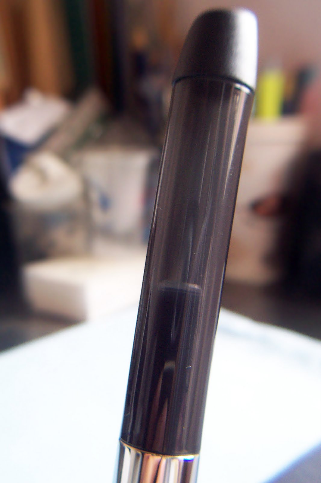
Do you see the cartridge inside the barrel? The iD has a transluscent gray barrel, black plastic end cap, and the distinctive wide metal chrome ring. This photo gave me an idea about what I can do next with this pen. Read on, the surprise is at the end. :)


Like the cap, this pen's section comes with black, soft rubber that is ergonomically-designed to fit snugly to the pen user's fingers. This feature is excellent because it will help the user write comfortably even at longer periods of time.


Here is the Schneider iD's nib, which comes with a new feature: a breather hole. The breather hole is important as it promotes the exchange of air and ink in the pen's reservoir. The nibs of my Base pens do not have this feature, though.

The Schneider iD has a German (European) medium nib, which is bolder than other medium nibs. The day I got this pen, I was itching to ink it right away using the cartridge that came with it. But I waited until I got home because I wanted to use my current favorite ink: Diamine Majestic Blue. And the pen (and ink) did not disappoint. The iD wrote as soon as I inked it. The nib is softer than I thought it would be, writes smoothly, and Diamine Majestic Blue flows well on paper. (See photo of writing sample on Kokuyo paper below.)


The underside of the feed and nib shows the enormous iridium on the tip.


Schneider logo on the nib.


M is for medium. This is imprinted on the nib's left ear.


Feed and nib up close.


I have generously mentioned the Schneider Base pen in this post. I feel that I must write about it as well. But for now, I am happy to present the two pens here for comparison. Below are photos of the Schneider iD and Base nibs side by side, front and underside. Note that the Base nib does not have a breather hole and the ears (as I want to call them now - if there is a real name for these, kindly let me know) as seen on the right photo showing the feed's underside. The Base pen's feed's underside also appears to be flatter than that of the iD's.

I wrote my handwritten pen review on Kokuyo paper. The iD wrote so well on this paper, but also on a variety of papers as well, such as my Venzi journal and Rhodia Reverse notebook. If you read what I wrote below, you will know that I named this pen Kay. :)

For the large image, click here.

The Schneider iD fountain pen takes standard short or long international cartridges. In fact, my pen came with one short international cartridge. A converter may also be used, but it will have to be bought separately from independent pen sellers. Schneider surprisingly, does not make their own converters.

And here is the surprise. :)

The transluscent barrel of the Schneider iD gave me the idea that I could turn this c/c pen to an eyedropper (ED). I noticed, too, the long threaded part of the section where it joins the barrel. To test it, I filled both barrel and cap with water and observed it for a couple of hours, carefully watching it for leaks. And... no leaks! I then applied some silicone oil  to the section threads and my Schneider iD fountain pen is an instant ED-filled pen! Hurray!

Below are photos of the Schneider iD filled with J. Herbin Orange Indien.


For this writing test, I chose my Rhodia pad to match the orange ink. ;) The Orange Indien is a suggestion of my good friend and fellow blogger Tom Overfield.

For the large image, click here.

CultPens currently describes the Schneider iD products as weird and wonderful. I understand that not all fountain pen enthusiasts will like the form, but I am sure that many will agree with me that this pen's performance is more than excellent. It won't win 1st Prize in the 2009 ISPA and Innovation Award for nothing, right? I love it and I will definitely get another pen or two when it becomes available locally. In the Philippines, Schneider pens are available at all Office Warehouse branches.

The Schneider iD fountain pen in this review is from Germany, courtesy of Schneider. It is part of the series that include two more pens: a ballpoint and a rotary pencil. All three pens are available in green, purple, and black, which is my pen's color. Right now, it is filled with Orange Indien and writes like a dream. :)
Read More
Posted in Diamine, fountain pen, ink review, J. Herbin, Majestic Blue, Orange Indien, pen review, Rhodia, Schneider iD, writing | No comments

Friday, 13 August 2010

Ink Review: Diamine Woodland Green

Posted on 03:00 by Unknown
Lost in the forest, I broke off a dark twig,
and lifted its whisper to my thirsty lips:
maybe it was the voice
of the rain crying,
a cracked bell,
or a torn heart.

- Pablo Neruda, 'Lost in the Forest'


It all started with a Vector. Then came some more. More Parkers, more Lamys, and more Sheaffers. That was followed by testing huge quantities of different notebooks for ink resistance, and scouring the streets of Recto for vintage inks. It did not end there. Not yet, for the search continued. For more inks. For more Parker Quinks, more Watermans, more Auroras, more J. Herbins. Here and there, a bottle of De Atramentis, Caran d'Ache, Iroshizuku, and Mont Blanc came around. But no Diamine. Until.

I have always wanted to try Diamine inks, but like most ink brands, it is not locally available. My current limitations dictate a moratorium on oline purchases, so I was in a bind. That's when the bright idea dawned on me. I wrote to Diamine. With fingers crossed (and hopes held high), I wrote to them and said I'd love to review their inks on my blog. Several days passed and no response came. I believed my request was turned down. But on March 1st, Diamine's Company Director Phil Davies sent me an email to say that several bottles of Diamine ink have been sent to me. Hurray!

And now, here is Woodland Green, and my first Diamine ink review.


Phil sent me six Diamine inks to try. Six! I got Majestic Blue, Royal Blue, Chocolate Brown, Orange, Poppy Red, and Woodland Green. I have tried to write and doodle with all of them, but because I'm into all things green now, I chose Woodland Green to be my first Diamine ink review.

Woodland Green is a dark, strong green ink with shades of blue. Unlike the bright Lierre Sauvage, this ink has a dark greenish-bluish shade. It has a gem-like quality when wet, and dries a beautiful dark green especially on light-colored paper.

The Diamine bottle is made of plastic, so ink easily gets off the inside surface. Here is the closest I could get to show the ink color through the bottle.


Woodland Green reminds me so much of Los Baños, especially Pili Drive – a long, narrow strip of road inside the UPLB Campus, lined with decades-old Pili trees with enormous trunks and thick canopies. The color of Woodland Green is akin to the shade provided by these huge trees.

Below is the written review of Diamine Woodland Green. I wrote on Kokuyo paper using two pens: an Osmiroid 65 with medium italic nib (black pen on the right), and my new green Wality 69TL with round medium nib.


Woodland Green is a saturated ink, as the other Diamine inks are. It flows well on both pens I used for this review. Shading is not very visible, but that could be attributed to the pens I used and not to the ink.

Here is a sampler of Diamine Woodland Green on Kokuyo paper.
Doodle was written with my Wality pen.


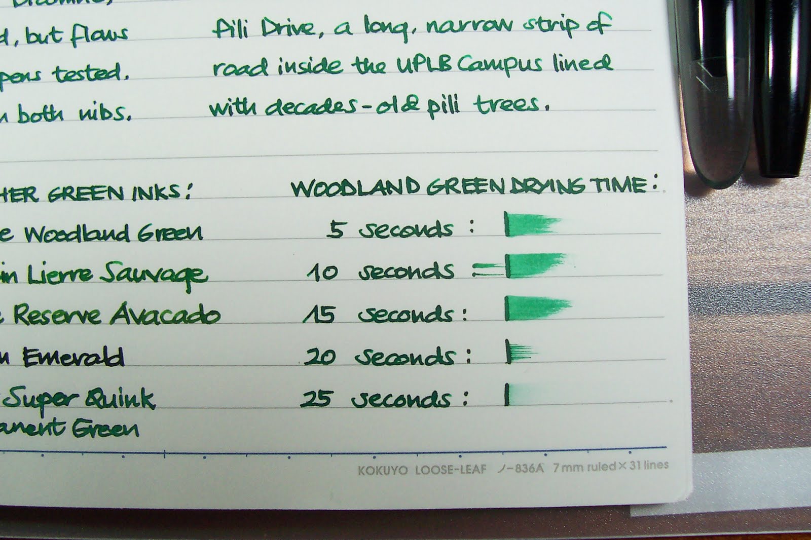
Here is another macro of ink smeared on paper, from the drying time test.
Note the shades of blue on the part where the ink begins to fade.


More macro shots here:


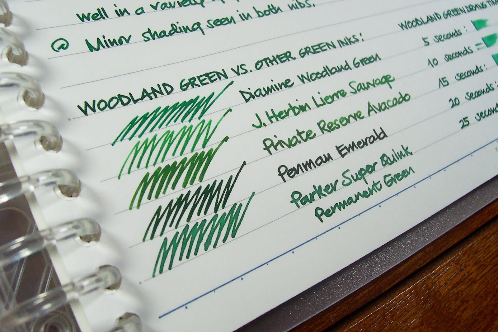
Here is Woodland Green in comparison with other green inks. It really has more blue compared to J. Herbin Lierre Sauvage (hints of yellow), Private Reserve Avacado, Penman Emerald, and Parker Super Quink Permanent Green (all with hints of black/gray).


Woodland Green takes a longer period of time to dry not only on Kokuyo paper, but also on Rhodia Reverse notebook. I also noticed that it's not very easy to take off Woodland Green ink on my fingers when I got stained while changing nibs on my Osmiroid pen.


And now, the poem. I have always loved Pablo Neruda's poems. I love his 'erotically charged love poems', especially those in his compilation book, Twenty Poems of Love and A Song of Despair; and the ones included in the soundtrack of the film Il Postino. It is only fitting to have this green ink review as a tribute to the poet who 'always wrote in green ink as it was the color of hope'.


Founded in London, Diamine has been manufacturing inks since 1864. Diamine is one of the largest producers of a large range of fountain pen ink as well as the famous Registrar's Ink for permanent records. Diamine fountain pen inks are available from the Diamine site or from the Writing Desk in the UK. In the US, they are available from the Pear Tree Pen Company. (I'm not affiliated with any of these companies.)
Read More
Posted in calligraphy, Diamine, fountain pens, ink review, Kokuyo, Osmiroid, paper, Wality, writing | No comments
Newer Posts Older Posts Home
Subscribe to: Posts (Atom)

Popular Posts

  • Notebook Review: Clairefontaine Basics Clothbound Notebook
    When I received the package that Karen Doherty of Exaclair sent me in September, I liked everything in it except a black, plain notebook. ...
  • Pen Review: Schneider iD Fountain Pen
    I love Schneider pens. I have a huuuge stash of Schneider gel pens, fineliners, and rollerballs hoarded collected before I shifted to fou...
  • Ink Review: J. Herbin 1670 Ink
    Red was your colour. If not red, then white. But red Was what you wrapped around you. Blood-red. Was it blood? Was it red-ochre, for warming...
  • Review: Unlimited Notebook by Rhodia
    When I received these Rhodia UNLIMITED notebooks that Karen Doherty sent to me last year, I asked her why they're called UNLIMITED. Kar...
  • Fountain Pen Review: Lamy Safari 2012 Limited Edition Green
    When I started using fountain pens in 2007, I was like any other newbie. I hoarded. I had no clear idea of what I really want and got pens I...
  • Ink Review: Sailor Jentle Grenade
    O drops of me! trickle, slow drops, candid, from me falling — drip, bleeding drops, ~ From "Trickle, Drops" by Walt Whitman One of...
  • Fountain Pen Review: Sheaffer Taranis
    Sheaffer celebrates their Centennial Year - 2013 - with a fleet of writing instruments including super limited edition pens and two new seri...
  • Oh, No...
    Oh, no. Not him, please... Actor Morgan Freeman is injured in car accident.
  • For Winter, Let's Have Cold Horizon
    (Courtesy of Bryan Bedell /  fieldnotesbrand.com ) And Field Notes has done it again. Wow me with their notebooks, that is. 2013's Wint...
  • An Idea Gone Wild and Wilder Gets Scrapped
    It is quite obvious that the last two months of my life is far from blissful. I really do not know for sure how I get by. People may shun me...

Categories

  • 1670 ink
  • 2012 Green
  • 2046
  • Aboitiz 2Go
  • Activebook
  • Agatha Ruiz de la Prada
  • Alice Wu
  • Ambre de Birmanie
  • Andy Garcia
  • aneurysm
  • Apple
  • Apple Green
  • Aquamarine Lamy Safari
  • Arthur Golden
  • asthma
  • Aurora
  • Aurora Blue
  • AV malformation
  • Banditapple Carnets
  • Bandzug
  • Baoer
  • beautiful things
  • Beijing Olympics souvenir
  • Bejewelled
  • Bench
  • Berroca
  • Binondo
  • birthdays
  • black
  • Bleu Pervenche
  • Blistex
  • blog advertising
  • blogging
  • blue
  • blue inks
  • blue notebooks
  • Body Shop
  • Books
  • Brause
  • Bridges of Madison County
  • broad
  • broad nibs
  • calligraphy
  • Camel Scarlet Red
  • Camlin Trinity
  • Caramoan
  • Caran d'Ache
  • Caran d'Ache Saffron
  • Cararama
  • Carnival of Pen Pencil and Paper
  • cars
  • Cattleya
  • Chelpark Moti
  • ChoroQ
  • Christmas
  • Chuck Taylor
  • Clairefontaine
  • Clint Eastwood
  • coffee
  • Coleto
  • Colibri
  • collecting
  • colors
  • Corgi
  • Corona notebooks
  • Cosmos Bazaar
  • Creative Zen
  • Cross
  • Daiso
  • Danitrio
  • Daycraft Juicy Notebook
  • Daycraft Notebook
  • Daycraft Signature
  • Daycraft Signature Notebook
  • De Atramentis
  • Diabolo Menthe
  • Diamine
  • Diamine Majestic Blue
  • Diamine Orange
  • Diana Krall
  • Diary
  • Dickies
  • Diesel
  • DKNY
  • dotPad
  • Eagle notebooks
  • Earl Grey
  • eBay
  • Edelstein
  • Effen Vodka
  • elephant
  • elephants
  • envelope
  • Esterbrook
  • Euro Office
  • Evanescence
  • Exaclair
  • Exacompta
  • ferris wheel
  • Field Notes
  • fire trucks
  • firetrucks
  • folder
  • food
  • Foray
  • fountain pen
  • fountain pen ink
  • fountain pen review
  • fountain pens
  • FPN-P
  • Frank
  • Fully Booked
  • G. Lalo
  • garage
  • gel pens
  • get paid to blog
  • GPW
  • Grandluxe
  • grassheads
  • Green
  • grid notebook
  • GTD
  • handwriting
  • Haolilai
  • Hard Rock
  • Haruki Murakami
  • health
  • hearbreak
  • heartbreak
  • Hero 221
  • Hero pens
  • Hero616
  • hobby
  • Ikea
  • Il Divo
  • ink
  • ink review
  • inks
  • Inoxcrom
  • iPaq
  • iPod mini
  • iron gall ink
  • J. Herbin
  • J. Herbin Rouille d'Ancré
  • James Blunt
  • James Patterson
  • Japanese ink
  • Jentle
  • Jinhao
  • Joan Chen
  • Jollibee
  • Journal
  • Kaj Stenvall
  • Karen Doherty
  • Kokuyo
  • Kramer vs. Kramer
  • Kultur
  • LA Gear
  • Laban
  • Lamy
  • Lamy Al-Star
  • Lamy Blue Black
  • Lamy Joy
  • Lamy Logo
  • Lamy Nexx
  • Lamy Safari
  • Lamy Safari Neon
  • Larmes de Cassis
  • leather
  • Lee
  • lesbianism
  • Lierre Sauvage
  • life
  • Limited Edition
  • lined notebook
  • lip gloss
  • love
  • Lynn Chen
  • Lyons
  • Mahatma Gandhi
  • Maisto
  • Majestic Blue
  • Manila
  • Manuscript
  • Master
  • Matchbox
  • Memoirs of A Geisha
  • Mesaki
  • Miami Ink
  • Michael Jackson
  • Michelle Krusiec
  • Midori
  • Midori Traveler's Notebook
  • migraine
  • Moleskine
  • MonAmi
  • Mont Blanc
  • Moore
  • Movies
  • MRA
  • MRI
  • Music
  • NaNoWriMo
  • National Bookstore
  • neon
  • new product
  • nib
  • nibs
  • Nike
  • Nokia
  • Noodler's
  • Noodlers
  • Norah Jones
  • notebook
  • notebook review
  • notebooks
  • notepad
  • novels
  • office stationery
  • office supplies
  • orange
  • Orange Indien
  • Osmiroid
  • Oxblood
  • Pablo Neruda
  • paper
  • paper review
  • Parker
  • Parker Penman
  • Parker Quink
  • Parker Rialto
  • Paulo Coelho
  • Pelikan
  • Pelikano Junior
  • pen and ink
  • pen holder
  • pen holders
  • pen review
  • pencils
  • Penman inks
  • pens
  • perfume
  • Phillips
  • Pilot 78G
  • Pilot Coleto
  • Pilot FriXion Ball
  • Pilot G2
  • Pilot GTEC
  • Pilot H32 mechanical pencil
  • Pilot pens
  • Pilot Petit
  • pink
  • planner
  • Platignum
  • Platinum Preppy
  • pocket notebook
  • poetry
  • police cars
  • polyurethane
  • Poppin
  • postcards
  • Postcrossing
  • Poussière de Lune
  • Private Reserve
  • Private Reserve Avacado
  • Private Reserve Copper Burst
  • product review
  • Pukka
  • Quiver
  • Quo Vadis
  • Quo Vadis Habana
  • reading
  • red
  • Red Dragon
  • red ink
  • reecovid
  • Retro 51
  • review
  • reviews
  • Rhodia
  • Ricky Martin
  • RJ100
  • Robert James Waller
  • Rocket Dog
  • Rotring
  • Rouge Opera
  • round corner
  • Safari
  • Saffron
  • Sailor
  • Samsung
  • San Francisco Bridge
  • Saving Face
  • scented inks
  • Schneider Base
  • Schneider iD
  • Schneider pens
  • Scribe
  • Scribe Writing Essentials
  • Scriptmaster II Series Mary Ann
  • Sharpie
  • Sheaffer
  • Sheaffer Taranis
  • shopping cart
  • shotglass
  • shotglasses
  • Siku
  • Simpsons
  • sleep
  • Somersby
  • Songs
  • Sony Ericsson
  • Staedtler
  • stamps
  • Starbucks
  • Sterling notebooks
  • Stradmore
  • stub nibs
  • stubs
  • Stypen
  • Symbicort
  • Syrah
  • Taranis
  • Tazo
  • Terre de Feu
  • Text Twist
  • The Archer
  • The Burns Sisters
  • The Graduate
  • The L Word
  • thyroidectomy
  • Timbuk2
  • TOMICA
  • TOMY
  • toy trucks
  • toys
  • turquoise
  • TWSBI
  • TWSBI notebook
  • typhoon
  • Uni-Ball
  • Uni-Ball Signo Gelstick
  • Ventolin
  • Visconti
  • Wality
  • water resistance test
  • Waterman
  • Waterman South Sea Blue
  • white fountain pens
  • Whitelines
  • Wong Kar Wai
  • Write-Now
  • writing
  • yellow
  • Youth pens
  • Zebra Jimnie
  • Zippi

Blog Archive

  • ▼  2013 (10)
    • ▼  November (1)
      • For Winter, Let's Have Cold Horizon
    • ►  September (1)
    • ►  June (2)
    • ►  May (1)
    • ►  April (1)
    • ►  March (1)
    • ►  February (3)
  • ►  2012 (5)
    • ►  November (1)
    • ►  June (2)
    • ►  February (1)
    • ►  January (1)
  • ►  2011 (16)
    • ►  December (1)
    • ►  November (1)
    • ►  October (2)
    • ►  August (3)
    • ►  July (1)
    • ►  June (2)
    • ►  May (1)
    • ►  April (2)
    • ►  February (1)
    • ►  January (2)
  • ►  2010 (17)
    • ►  November (2)
    • ►  August (3)
    • ►  July (1)
    • ►  June (2)
    • ►  May (1)
    • ►  April (1)
    • ►  March (3)
    • ►  February (3)
    • ►  January (1)
  • ►  2009 (51)
    • ►  December (1)
    • ►  November (1)
    • ►  October (7)
    • ►  September (3)
    • ►  August (5)
    • ►  July (5)
    • ►  June (6)
    • ►  May (5)
    • ►  April (6)
    • ►  March (3)
    • ►  February (6)
    • ►  January (3)
  • ►  2008 (107)
    • ►  December (1)
    • ►  November (5)
    • ►  October (4)
    • ►  September (14)
    • ►  August (10)
    • ►  July (21)
    • ►  June (10)
    • ►  May (4)
    • ►  April (9)
    • ►  March (10)
    • ►  February (12)
    • ►  January (7)
  • ►  2007 (48)
    • ►  December (1)
    • ►  November (3)
    • ►  October (9)
    • ►  September (10)
    • ►  August (3)
    • ►  June (6)
    • ►  May (4)
    • ►  April (3)
    • ►  March (3)
    • ►  February (5)
    • ►  January (1)
  • ►  2006 (6)
    • ►  August (6)
Powered by Blogger.

About Me

Unknown
View my complete profile