Notebook Info

  • Subscribe to our RSS feed.
  • Twitter
  • StumbleUpon
  • Reddit
  • Facebook
  • Digg
Showing posts with label Diamine. Show all posts

Thursday, 5 September 2013

Notebook Review: TWSBI

Posted on 05:00 by Unknown

When I shifted to full fountain pen use in 2008, I didn't realize that the major challenge I would have to face was to find suitable paper types for my pens and their inks. My lack of knowledge then about the proper pen, ink, and paper combinations brought home stacks of useless pads and notebooks. Since then, I have found notebooks that are friendlier to my fountain pens, but when Taiwan-based company TWSBI announced that they are coming up with a line of notebooks tailored for fountain use, I was curious. When Scribe Writing Essentials, the local distributor of TWSBI products in the Philippines, sent me a medium lined TWSBI notebook to review, I was thrilled.

TWSBI promotes their notebooks as "universal to all types of writing/drawing instruments, however, specially tailored for fountain pens." Their notebooks have soft and textured but shiny covers made of  fine polyurethane (PU). TWSBI made sure their notebooks are easily identified in the crowd, with the company's logo heat-pressed neatly onto the PU in the front cover.


The logo is again heat-pressed on the bottom of the back cover, but includes their acronym, TWSBI.

TWSBI offers their notebooks in three sizes: small (3.75 × 5.5 in), medium (5.25 × 8.25 in), and large (7.5 × 9.8 in). Each size is available in lined, grid, or blank pages. All notebook sizes have 120 sheets of paper, or 250 pages, but the small notebook has perforated sheets.


A black elastic strap holds the cover and notebook pages together, but it's a bit loose. I wish TWSBI used a stronger and wider strap for their medium and large notebooks.


In the photo below, the TWSBI notebook (on top) has the thinnest elastic strap although it's the thickest. The notebooks below the TWSBI are: Quo Vadis Habana, Moleskine, and Rhodia Webbie.


Despite the thin elastic strap, the red page ribbon marker adds vibrance to this black notebook. It's also a nice, thoughtful touch of TWSBI to have the end of the ribbon glued to prevent fraying. Most new notebooks come with loose ribbon ends and I usually just tie them into small knots to avoid early fraying.


The makers of these notebooks paid a lot of attention to detail: the notebooks have round page corners! I've always preferred round corners in my notebooks. I don't like pointed corners because they are sharp and dig into my palms when I write, and they also fray easily.


The pages of the TWSBI notebooks are sewn, to ensure more page security and flexibility. Sewn binding is so much better than most punch and bind methods because the pages are more secure and they also look tidier.


The paper used in these notebooks is not cream color, but it's not pearly white, either. It is off-white, soft, and smooth. TWSBI did not indicate the weight nor the type of paper used on these notebooks, but I'll guess it to be around 80gsm. Another plus for these cool notebooks: the binding allows them to open completely flat. The pages are not glued to the spine to give it full flexiblity.


The soft PU cover is flexible and the spine easily folds when the notebook is open.
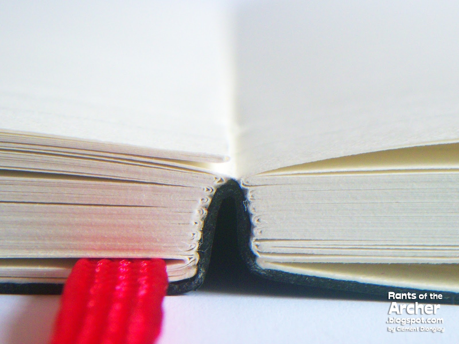

See? No bulges, no bumps, no big creases to get in the way of the inside pages while the notebook is open.


Again, I am not sure about the paper type used in TWSBI's notebooks, but they are certainly excellent for fountain pen use. It's a brilliant move of TWSBI to use a faint gray ruling in the notebooks' pages, instead of black, or blue.


And unlike most notebooks with continuous line ruling, TWSBI used faint dotted lines, which is just fine. The faint gray lines are perfect for writing, but they do not get in the way of it at all.


I was really excited to try this notebook's paper and filled a page with different pen and ink combinations. I also included in the test page some of my remaining gel pens and rollerball pens. True enough to their claim, TWSBI's notebooks are perfectly suited to fountain pen use. Most of my pens have stub, medium, broad, and italic nibs that bleed ink on most paper types. But the paper in this notebook behaved so much better than I expected, and I was so amazed to see clean lines — no excessive feathering, and not a trace of bleeding. There is some see-through though, but again, that's fine because writing on both sides of the page is still possible.


The back side of my pen and ink test page did not show any bleeding at all.


I was not able to do a test for different ink's dry times, but I did not have any problems with drying ink when I did the pen and ink tests. Below are samples of the inks I used and there is no significant feathering and no bleeding at all. From top: Diamine Royal Blue (TWSBI 540 medium nib), Pelikan Edelstein Jade (Pelikan M205 medium nib), Diamine Red Dragon (Pelikan M400 medium nib), and Noodler's Air Corp Blue Black (Lamy Safari 1.1 italic nib).


Overall, TWSBI's notebooks are excellent to use with fountain pens. They are simple, yet very attractive and have the "classic black notebook" elegant look. They have soft flexible covers, an elastic strap to keep the pages together, the pages have round corners, and the paper is excellent for any pen type. Each of TWSBI's notebooks has that happy vibrant red ribbon page marker and back pockets with red accents. These notebooks are perfect for note taking and journaling, and they do not cost a fortune. I really, really like my medium TWSBI notebook, and again, it is super friendly to my fountain pens!

To get these notebooks from TWSBI, visit: http://www.twsbi.com/category.php?id_category=9.

In the Philippines, these wonderful notebooks are available at Scribe Writing Essentials together with TWSBI fountain pens and ink bottles, with the following prices:

  • Small: PhP 495
  • Medium: PhP 675
  • Large: PhP 845

Read More
Posted in Diamine, Edelstein, fountain pens, ink, Lamy Safari, Noodler's, notebook, Pelikan, Scribe Writing Essentials, TWSBI, TWSBI notebook | No comments

Sunday, 20 November 2011

Notebook Review: Quo Vadis Keith Haring Artist Series

Posted on 05:15 by Unknown

I have a lot of notebooks. I actually have an insane number of them inside my 'notebook cabinet'. While some are from my impulse buys, most of them came from my silent sponsors, as samples for review. I'm fascinated by colorful things, but I have always been fond of plain-covered notebooks. I like using any black-covered ones for journal writing and note taking. I also use a small black notebook for the 'ink diary' that I keep (more on that on the next notebook review). 

When I received the Keith Haring Quo Vadis Habana notebooks that Karen Doherty (Exaclair's USA VP for   Marketing) sent to me a few months ago, it wasn't exactly love at first sight. Late last month, while I was sick and recovering at home, I saw the notebooks again and decided to try them out. That time, though, it was definitely love at first write.

Keith Haring Habana notebooks are the most recent addition to the Quo Vadis limited edition Artist Series that include the art of Pablo Picasso and Henry Matisse. Picasso's "Portrait of Dora Maar" and Matisse's "Icarus" and "The Creole Dancer" are the selected cover designs of their respective series.

Keith Haring's "Earth Day" and "Baby" on small Quo Vadis Habana notebooks.


These Keith Haring Habana notebooks, as with the other notebooks in the Quo Vadis' Artist Series, are made in France, with leather-like cover material which I love because they are soft, not very smooth, and not shiny either. This leather-like material is wrapped on what I assume is thick board, making the cover solid. The firm, solid covers of Quo Vadis Habana notebooks are made to provide writing support. Photo below shows the notebooks' back covers, printed with Keith Haring icons in the middle, while the Quo Vadis logo is etched in the bottom.


Quo Vadis made Keith Haring Habana notebooks in four designs and two sizes. The four designs are: 'Baby', 'Heart', 'Earth Day', and 'La Ronde'. They are available as either small (4" x 6") or large (6¼" x 9½") notebooks. Both Haring Habanas used in this review are small notebooks.

"Earth Day" is only available in small (4" x 6") size.

"Heart", though, comes in small (4" x 6") and large (6¼" x 9½") sizes.


The Keith Haring Habana notebooks have the same features as their regular counterparts: they have the elegant page ribbons/markers and elastic closures in matching colors. Soon I'll be tying the end of the page ribbons into knots to prevent ugly fraying.

Keith Haring's signature is printed in white on the notebooks' front covers. How elegant.


The small Haring Habana notebooks have 96 sheets of very smoooooth satin ivory paper. The pages have 5.5mm ruling, a welcome change from the wide 8mm ruling previously used on both large and small Habana notebooks. The pages have round corners too, which is great. I prefer notebooks with round corners because sharp page corners can sometimes cut into my fingers and palms when I'm writing. Round corners also look more elegant and stylish.

Round page corners of the Haring Habana notebooks.


Another wonderful feature of Quo Vadis Habana notebooks, including the Haring Habanas, is their sewn binding. This ensures more page security and flexibility, and also (again) adds to the notebooks' elegance. Sewn binding is so much better than most punch and bind methods because the pages are more secure and also tidy.

Sewn pages of the small Haring Habana notebooks.


These special Habana notebooks have lovely spines printed with Keith Haring's signature and icon. Definitely a welcome change from the old, plain spines of my previous notebooks.

The Haring Habana notebooks have printed spines.


The Habana's "small" is not the same in size as the "pocket" of other notebook brands, which is always misunderstood by many users who think that the two sizes are interchangeable. "Small" and "pocket" sizes are not the same. Several brands share the same "pocket" size, such as Moleskine and Rhodia, and Scribe here in the Philippines, while Quo Vadis uses the "small" size alone.

Size comparison: Two pocket notebooks on top, Moleskine and Rhodia. 
The two notebooks below are regular Rhodia and Keith Haring Habana.


I mentioned earlier that the Haring Habanas have smooth satin ivory paper. It is really very, very smoooooth but I did not have any difficulty writing on it. In fact, the smoothness made writing very easy and comfortable, compared to other overly smooth paper types that make writing uncomfortable. I also noticed that while the ruling in the old Habana notebook pages went all the way to the binding, it has a certain margin in the new notebooks.

If paper can make people happy, the Haring Habanas' paper will. 
I know because the smooth satin ivory paper made me happy.


Unlike the previous Habana notebooks with continuous lines, the Haring Habanas have dotted lines. But that's fine. The dotted lines didn't get in the way of my writing, or with the readability of what I've written. I actually think this is cool.

Haring Habana page up close. See the dotted lines?


Below is a page devoted to pen and ink tests, and I included gelpens, felt markers, and a permanent marker in the list to fully test the paper. All the fountain pen inks I tested on the Haring Habana fared very well. I did not see any serious feathering or bleed, even with the notorious bleeder, Noodler's Midnight Blue. I also used a couple of pens with broad Esterbrook nibs such as the Transitional J with Private Reserve Black Magic Blue and J pen with J. Herbin Lierre Sauvage. This is good news, and it made me very happy.

The "non-fountain pen" pens I used in the pen and ink test include Pilot G2s, Stabilo felt markers, Zebra Sarasas, and a Sharpie Ultra Fine Permanent Marker. All the other pens wrote well without feathering or bleed, except for the Sharpie which feathered and bled like an open faucet. But that's just okay. Sharpies bleed bad on most papers.

Inks on the Haring Habana up close: Waterman South Sea Blue, Pelikan Blue Black, 
Private Reserve Black Magic Blue, and Pelikan Edelstein Jade.

The "non-fountain pen" pens: Pilot G2, Stabilo, Zebra Sarasa, 
and Sharpie Ultra Fine Permanent Marker.


Shown here below is the back of the pen and ink test page. It's almost clean, without any ink bleed, except for the one on the bottom part of the page. which is the Sharpie pen.

Sharpie pen bleeds at the bottom of the page.


Overall, I am a very happy recipient of these notebooks and I am beginning to think of how to use them soon. A small journal? A notebook for my daily notes? Who knows? Being the fanatic that I am, I'm sure I'll find a way to use them sooner than I thought I would. Now you know where to get yours, right? All information about these lovely Keith Haring Habana notebooks are posted Quo Vadis' site here: http://quovadisplanners.com/notebooks, and also at the Quo Vadis blog here: http://quovadisblog.com/

The Quo Vadis Keith Haring Habana notebooks used in this review are from Exaclair, Inc. through Karen Doherty. The pens and inks used in this review all belong to my personal collection.
Read More
Posted in Diamine, Exaclair, handwriting, J. Herbin, Moleskine, notebook, notebook review, Private Reserve, Quo Vadis Habana | No comments

Saturday, 22 October 2011

Notebook Review: Midori Traveler's Journal

Posted on 03:46 by Unknown

The Midori Traveler's Notebook has been one of my grail notebooks for the longest time. When I started collecting (and using) high-quality notebooks, I read about it at Patrick Ng's Scription site, and instantly fell in love with it. I wanted it, but I knew I could not have one. Yet. It was expensive and not available here in the Philippines. So I just continued to ogle at the thousands of Midori Traveler's Notebook photos on Flickr.

Unknown to me, the Philippines' biggest seller of fountain pen related stuff, Scribe Writing Essentials, has began stocking up and selling this highly coveted cultish notebook. After talking to its owner, Marian Ong, a notebook set was sent to me for review, pronto.

Marian sent me a large black Traveler's Notebook (TN) and I was instantly amazed by its Japanese packaging style, which is both presentation and function. Midori's packaging is minimalist and simple, yet elegant and classy. The notebook is packaged very well inside what looks like a thin box made from kraft paper, held together by a firm black elastic band. A small flyer about the notebook is also included in the packaging.


Inside the box are: large black leather Midori TN, cotton slipcase for the notebook, blank notebook refill (003), and a spare red elastic band to hold the notebook cover and refills. The soft cowhide leather of the Midori notebook/journal (sourced from Chiang Mai, Thailand), and the wide variety of changeable inserts, embellishments and other accessories give it a unique charm and magic.


The first thing on my mind when I saw my Midori TN is the paper used in the notebook refill. Paper is very important to me as I am a regular user of fountain pens. And I am ready and willing to forego any notebook if the paper cannot tolerate my very wet fountain pens and very saturated inks. Would it stand fountain pen use? Or would ink feather and bleed through its pages? Luckily for Midori TN, I knew that I can make my own refills, so paper is not an issue, but I'll discuss that towards the later part of this review.

The blank notebook refill has a kraft board cover and 64 pages of cream-colored paper . The inside cover page is printed with an upright rectangular box and the Midori logo.


As soon as the notebook was out of the box, it's customization galore!!! The first thing I did was to change the elastic bands. I opted to use the red band to give the notebook some contrast and brightness. The tiny round thing on the upper left corner of the notebook cover holds the elastic bands that keep the notebook inserts in place.


I rummaged through my boxes of stuff and found a small glass bead charm I could use to secure the end of the Midori TN's thin bookmark. Lovely, isn't it?


Next, I made my own refills using pages off my large Rhodia dotPad. I went to a printer, had them saddle-stapled several notebooks, and trimmed according to the Midori TN refill size. I recycled Starbucks paper bags as covers for my new refill notebooks. I had fun making Dymo tags for them too.


The first notebook is for lists of everything I have done and finished the whole day --  an inverted 'to-do' list.


The second refill is for my notes. Any notes. Blog ideas, project concepts, sketches, hand drawn maps, phone numbers, pen and paper stores, ink notes, restaurant bestsellers, etc.


Refill number three is a microjournal, called so because I have a full journal already. I just want to have a journal in my Midori TN. I have small writeups in this notebook about places I visited, postcards I received, books I've read, or movies I've watched.


I have also included Midori's plastic zipper pocket refill. This refill has one large zippered pocket and another pocket without a zipper. The zippered pocket can hold a lot of stuff, especially small pieces of paper such as receipts, stamps, business cards. Sometimes I put a pen or two inside and still manage to zip it. The pocket without zipper can accommodate bigger sizes of paper like postcards, prescription notes, etc.


Perhaps you've noticed that I've added another bookmark to my Midori TN with a new charm. I made one more bookmark for my "Finished/Done" notebook, as the original bookmark/charm is used on my microjournal. I love these charms!


But the customization does not end there for my Midori TN. It's now full of stickers and stuff (stamps, tea bag tags, postcards, etc. I know there will be more of these as the leather gets more scratches and scuffs softens with use and becomes more beautiful. 

Finally, the paper test. The refill that came with my Midori TN is blank. As I have difficulty writing on blank pages, I went ahead and ordered a ruled/lined refill which is what I used in the pen and ink test below. The cream-colored paper used in the ruled/lined refill is Midori paper. There are two types of paper used on Midori's notebook refills. One is Midori Diary (MD) Paper, the other is Designphil Pocket Book (DP) Paper. A note in the Midori website (here) gives a full explanation on the differences of the two paper types.

Midori Paper is smooth and thankfully fountain pen friendly. Some ink types showed feathering, but not one of all the inks I tested here bled.


Below is the back of the pen and ink test I did. There is not bleeding at all. The tiny blob of orange is show through, but it is very mild and not very noticeable. I say I'll be using this refill for another microjournal when my own refills ran out of pages.


I've kept the red elastic band for now and rotate several black bands with different combinations of trinkets and charms. One band has a small pewter elephant, another has a series of different color beads with a drop of olive green Swarovski stones, rescued from an earring without a matching pair. I've also changed charms since, and I have ordered a batch of lovely charms from a local supplier. I have stocked up on black elastic band from a local crafts store and just yesterday, I got a set of vintage letterstamps I'll use for more fun of notebook customizations. Will I use this notebook for how long it will be serviceable? Yes. With a notebook as versatile as the Midori TN, who wouldn't? The possibilities with the Midori Traveler's Notebook is excitingly never-ending!

The large Midori Traveler's Notebook used in this review is courtesy of Scribe Writing Essentials, and the regular, passport size notebooks and their refills are all available in their Eastwood City Mall store. A regular/large Midori Traveler's Notebook set sells for PHP2,595 (~US$61), while a passport-sized notebook costs PHP2,295 (~US$54). If you are somewhere in Asia, and would like to try the possibility of ordering from them, give them a call at +63 2 487 6339. 
Read More
Posted in Diamine, J. Herbin, Lamy, Midori, Midori Traveler's Notebook, notebook review, notebooks, Scribe Writing Essentials | No comments

Thursday, 13 October 2011

On Review: 12 Red Inks

Posted on 21:00 by Unknown
Can you guess how many red inks are here?

I know I did not reveal the answer as soon as I have promised, but did you make a guess? Did you get it right? If your guess is 12, then you got it! There is a dozen red inks in this doodle and in this huge red ink review. Twelve! Some of them are inks I have reviewed here before, but most are new.

I remember that the first time I did a combined ink review was for my first set of J. Herbin inks – Bleu Pervenche and Rouge Opera. That was ages ago, and recently, I felt like doing one again. This time though, I got more than two, as my ink stash have grown quite a bit. And I love red inks, as much as I love brown and dark blue inks. So here are the 12 red inks in my current collection.

The 12 inks here are J. Herbin Rouge Opera; Diamine Poppy Red, Red Dragon, Syrah, and Oxblood; Parker Quink Red; De Atramentis Fuschia; Herbin 1670 Anniversary ink; Camel Scarlet Red; Styl' Honoré Cocktail ink Rouge Amaryllis; and Mont Blanc Bordeaux.

A group pic of all 12 inks.

 And all of them again in swatches on Clairefontaine's Graf It Sketch 90g white paper.  

PARKER QUINK PERMANENT RED
Parker Quink Permanent Red has a pale red hue that appears more like pink when used with fine nibbed pens. This ink looks better on pens with wider nibs such as the stub on the Parker Jotter I used here. It has very minimal shading, not saturated, and flows well. However, it is not colorfast, and fades after some time.


CAMEL SCARLET RED
Camel Scarlet Red is brighter and redder than Quink Red, but still leans on the pinkish side. On fine nibs, it appears more as bright pink than red, as it is on the writing sample above, written using a Pelikano Junior with a fine nib. On wider nibs, however, it looks better, brighter, and redder. Camel Scarlet Red is a saturated ink, but shows very minimal shading. It dries fast, though. 


DIAMINE POPPY RED
Diamine Poppy Red is a bright, vibrant, 'orangey' red. Like most Diamine inks I’ve used and reviewed, this red ink is highly saturated, but has surprisingly excellent flow and is quick drying. I have tried it on several pens with different nibs - including a Waterman Phileas with a wet medium nib - and the results are the same – it has no shading at all. It is very flat, like Diamine Orange, but that's just fine. If I ever need a red ink for editing and correcting, I’ll choose Diamine Poppy Red anytime.


ROUGE HEMATITE/J. HERBIN 1670 INK
I’ve read almost everything that has been said and written about this ink, and it’s still one of my favorites. Never mind that J. Herbin’s 1670 Anniversary ink is way, way too saturated and slow drying. Never mind that it stained the converter of my Waterman Hemisphere. Never mind that it gives any pen filled with it with an ugly and horrible nib creep and dried yucky caked ink on the nib and feed. Never mind. Rouge Hematite, the correct name of this J. Herbin ink, is, and will always be a favorite. Its unique color of bright orange and earthy blood red with tiny gold specks is just wonderful. The gold specks give it the most amazing, and most unique shading.


STYL' HONORÉ COCKTAIL INK ROUGE AMARYLLIS
Rouge Amaryllis is among the very limited, highly coveted Styl’ Honoré Encre Cocktail Ink series. This ink has a lovely dark red color with strong hints of purple that makes it look almost like burgundy. It has excellent shading, especially in wide-nibbed pens such as the wet medium Parker 45 I used in this review. Rouge Amaryllis has medium saturation which ensured excellent flow and good drying time. The cocktail ink series were sold in a fountain pen boutique named Styl’ Honoré in Paris, made by the store owner Patrick Arabian. The cocktail inks have been described as the ‘best ink’ ever, but Patrick Arabian has stopped making them.


MONT BLANC BORDEAUX
Mont Blanc’s Bordeaux ink has the typical red wine color, but it’s not as dark as I want it to be. Still, it’s a unique red color with hints of purple, though not enough purple is present to darken it a bit more. Most inks are not colorfast, and Mont Blanc Bordeaux is sadly one of them. It easily fades after drying and fades even more after some time. It is not as saturated as my bottle of Mont Blanc Black, but it has excellent flow and dries fast even when used on a wet medium Parker Rialto.


DE ATRAMENTIS FUCHSIA
Fuchsia is a coveted color for me. It reminds me of little girls’ dresses and the long silk ribbons in their hair. De Atramentis Fuchsia has a vivid, strong, and deep reddish-purple color that looks lush and rich at the same time. It’s the perfect companion to my first run limited edition pink Lamy Safari with a smooth medium nib. This ink is very saturated and thus, takes a lot of time to dry, but it has excellent shading and a consistent flow.


J. HERBIN ROUGE OPÉRA
Herbin’s Rouge Opéra is among my first two inks from Exaclair. It was magical to finally get a taste of a non-Parker, non-blue, non-black ink for the first time. I was instantly drawn to Rouge Opéra’s dusky rose color, and the shy hints of purple is just perfect to give it a unique and balanced red-purple hue. Like most of J. Herbin inks, Rouge Opéra has excellent flow because of its medium saturation. On the Pelikan M205’s super wet medium nib, it’s like turning on a tap as soon as the nib touches paper, but it dries fast on most paper types. The most unique thing about this ink? It smells nice.


PARKER PENMAN RUBY
Parker’s Penman ink series has long been discontinued due to complaints that it tends to clog and eventually destroy pens. What a shame. Penman Ruby is one of the few unique red ink colors I’ve seen, and for that, I’ll try to forget its flaws. At times, it looks like reddish brown, but sometimes, it appears like burgundy. Both unique beautiful colors, and the shading is just excellent. But it is a very saturated ink and writes dry on a medium Parker 25. I have not experienced any issues regarding its flow, but the dryness makes writing uncomfortable for me. Then again, at times when I'm in the mood for a different red, I’ll pop a cart of Penman Ruby onto one of my Parker pens. Pronto.


DIAMINE SYRAH
Diamine launched Syrah, together with Red Dragon, Oxblood and seven other colors in 2010. Syrah's color was derived from Binder Burgundy, the famous ink color that Richard Binder developed on his own by mixing specific parts of Sheaffer Red and Waterman Violet. News said that Binder worked with Diamine to make a color that will exactly match his mixture, and that became Syrah. 

Syrah and the two other reds are absolute favorites in my ink stash. Who wouldn't be attracted to Syrah -- to its wonderful deep red/burgundy ink color? The blue, purple, and red combination is perfectly attained in this mixture to produce an excellent burgundy that does not come strong as red or purple. (Yes, somewhere there's blue in this ink.) It dries a beautiful burgundy, (which is how I hoped Mont Blanc's Bordeaux would turn out to be when it dries) and shows beautiful shading, especially in wide nibs such as the medium nib on my TWSBI 530. It’s a very saturated ink too, and not fast drying (but it dries). For more details about this beautiful ink, watch out for the full review which I am soon to finish. 


DIAMINE RED DRAGON
Diamine Red Dragon is a deep, dark red ink color that has similar qualities as Herbin's Rouge Hematite. The 'orangey' red and earthy tones make a red-blood color. Like Syrah, Red Dragon is a highly saturated ink, which is perhaps the reason why it has minimal shading only. It has excellent flow, and thankfully writes wet and  smooth on the fine nib of my Pilot Non-Self Filling pen. Yet again, like Syrah, Red Dragon takes longer time to dry, especially on high quality papers such as Clairefontaine and Daycraft.


DIAMINE OXBLOOD
Diamine Oxblood is one of the few available inks in the market today to resemble the true color of fresh blood. It is a lovely deep dark red - darker than Red Dragon - with more brown in it. Oxblood is another highly saturated ink from Diamine with minimal but beautiful shading. On my Pelikan M205's medium nib, it does not show a lot, but on the 1.1 Lamy Joy nib, the shading is simply awesome! Oxblood, despite its high level of saturation has excellent flow. It just takes a while to dry, though.


I've been lucky enough to have all these 12 red beautiful inks. I'm drawn to the darker ones and my obvious absolute favorites are Herbin's Rouge Opéra and Rouge Hematite; and Diamine's wonderful triumvirate of Syrah, Red Dragon and Oxblood. I always have these beautiful inks in my rotation.


I love group shots! Here are the 12 pens I used for the review. Most of them are regulars, I just added the rest. For a glimpse of how the inks behaved in different pens, here they are:
  • Parker Jotter (stub, courtesy of Pentageli) with Parker Super Quink Permanent Red;
  • Pelikan Pelikano Junior (fine) with Camel Scarlet Red;
  • Waterman Phileas (medium) with Diamine Poppy Red;
  • Waterman Hemisphere (medium) with J. Herbin 1670 Anniversary ink;
  • Parker 45 (medium) with Styl' Honoré Rouge Amaryllis;
  • Parker Rialto (medium) with Mont Blanc Bordeaux;
  • Lamy Safari (medium) with De Atramentis Fuchsia;
  • Pelikan M205 (medium) with J. Herbin Rouge Opéra;
  • Parker 25 (medium) with Parker Penman Ruby;
  • TWSBI 530 (medium) with Diamine Syrah;
  • Pilot NSF FP (medium) with Diamine Red Dragon; and
  • Pelikan M205 (medium) with Diamine Oxblood

Lastly, I just want to acknowledge the kind friends who gave me the inks in this huge review. Diamine Poppy Red, Syrah, Red Dragon, and Oxblood are all from Diamine of UK, sent by Phil Davies; J. Herbin 1670 Anniversary ink and Rouge Opéra are from Exaclair's VP for Marketing Karen Doherty; Styl' Honoré Rouge Amaryllis is from fellow FPN-P member Carl S. Cunanan, and De Atramentis Fuchsia is from my best buddy in the western hemisphere, Tom Overfield. The rest of the 12 are mine.
Read More
Posted in 1670 ink, Diamine, ink review, J. Herbin, Mont Blanc, Oxblood, Parker Penman, Red Dragon, Syrah | No comments
Older Posts Home
Subscribe to: Posts (Atom)

Popular Posts

Categories

  • 1670 ink
  • 2012 Green
  • 2046
  • Aboitiz 2Go
  • Activebook
  • Agatha Ruiz de la Prada
  • Alice Wu
  • Ambre de Birmanie
  • Andy Garcia
  • aneurysm
  • Apple
  • Apple Green
  • Aquamarine Lamy Safari
  • Arthur Golden
  • asthma
  • Aurora
  • Aurora Blue
  • AV malformation
  • Banditapple Carnets
  • Bandzug
  • Baoer
  • beautiful things
  • Beijing Olympics souvenir
  • Bejewelled
  • Bench
  • Berroca
  • Binondo
  • birthdays
  • black
  • Bleu Pervenche
  • Blistex
  • blog advertising
  • blogging
  • blue
  • blue inks
  • blue notebooks
  • Body Shop
  • Books
  • Brause
  • Bridges of Madison County
  • broad
  • broad nibs
  • calligraphy
  • Camel Scarlet Red
  • Camlin Trinity
  • Caramoan
  • Caran d'Ache
  • Caran d'Ache Saffron
  • Cararama
  • Carnival of Pen Pencil and Paper
  • cars
  • Cattleya
  • Chelpark Moti
  • ChoroQ
  • Christmas
  • Chuck Taylor
  • Clairefontaine
  • Clint Eastwood
  • coffee
  • Coleto
  • Colibri
  • collecting
  • colors
  • Corgi
  • Corona notebooks
  • Cosmos Bazaar
  • Creative Zen
  • Cross
  • Daiso
  • Danitrio
  • Daycraft Juicy Notebook
  • Daycraft Notebook
  • Daycraft Signature
  • Daycraft Signature Notebook
  • De Atramentis
  • Diabolo Menthe
  • Diamine
  • Diamine Majestic Blue
  • Diamine Orange
  • Diana Krall
  • Diary
  • Dickies
  • Diesel
  • DKNY
  • dotPad
  • Eagle notebooks
  • Earl Grey
  • eBay
  • Edelstein
  • Effen Vodka
  • elephant
  • elephants
  • envelope
  • Esterbrook
  • Euro Office
  • Evanescence
  • Exaclair
  • Exacompta
  • ferris wheel
  • Field Notes
  • fire trucks
  • firetrucks
  • folder
  • food
  • Foray
  • fountain pen
  • fountain pen ink
  • fountain pen review
  • fountain pens
  • FPN-P
  • Frank
  • Fully Booked
  • G. Lalo
  • garage
  • gel pens
  • get paid to blog
  • GPW
  • Grandluxe
  • grassheads
  • Green
  • grid notebook
  • GTD
  • handwriting
  • Haolilai
  • Hard Rock
  • Haruki Murakami
  • health
  • hearbreak
  • heartbreak
  • Hero 221
  • Hero pens
  • Hero616
  • hobby
  • Ikea
  • Il Divo
  • ink
  • ink review
  • inks
  • Inoxcrom
  • iPaq
  • iPod mini
  • iron gall ink
  • J. Herbin
  • J. Herbin Rouille d'Ancré
  • James Blunt
  • James Patterson
  • Japanese ink
  • Jentle
  • Jinhao
  • Joan Chen
  • Jollibee
  • Journal
  • Kaj Stenvall
  • Karen Doherty
  • Kokuyo
  • Kramer vs. Kramer
  • Kultur
  • LA Gear
  • Laban
  • Lamy
  • Lamy Al-Star
  • Lamy Blue Black
  • Lamy Joy
  • Lamy Logo
  • Lamy Nexx
  • Lamy Safari
  • Lamy Safari Neon
  • Larmes de Cassis
  • leather
  • Lee
  • lesbianism
  • Lierre Sauvage
  • life
  • Limited Edition
  • lined notebook
  • lip gloss
  • love
  • Lynn Chen
  • Lyons
  • Mahatma Gandhi
  • Maisto
  • Majestic Blue
  • Manila
  • Manuscript
  • Master
  • Matchbox
  • Memoirs of A Geisha
  • Mesaki
  • Miami Ink
  • Michael Jackson
  • Michelle Krusiec
  • Midori
  • Midori Traveler's Notebook
  • migraine
  • Moleskine
  • MonAmi
  • Mont Blanc
  • Moore
  • Movies
  • MRA
  • MRI
  • Music
  • NaNoWriMo
  • National Bookstore
  • neon
  • new product
  • nib
  • nibs
  • Nike
  • Nokia
  • Noodler's
  • Noodlers
  • Norah Jones
  • notebook
  • notebook review
  • notebooks
  • notepad
  • novels
  • office stationery
  • office supplies
  • orange
  • Orange Indien
  • Osmiroid
  • Oxblood
  • Pablo Neruda
  • paper
  • paper review
  • Parker
  • Parker Penman
  • Parker Quink
  • Parker Rialto
  • Paulo Coelho
  • Pelikan
  • Pelikano Junior
  • pen and ink
  • pen holder
  • pen holders
  • pen review
  • pencils
  • Penman inks
  • pens
  • perfume
  • Phillips
  • Pilot 78G
  • Pilot Coleto
  • Pilot FriXion Ball
  • Pilot G2
  • Pilot GTEC
  • Pilot H32 mechanical pencil
  • Pilot pens
  • Pilot Petit
  • pink
  • planner
  • Platignum
  • Platinum Preppy
  • pocket notebook
  • poetry
  • police cars
  • polyurethane
  • Poppin
  • postcards
  • Postcrossing
  • Poussière de Lune
  • Private Reserve
  • Private Reserve Avacado
  • Private Reserve Copper Burst
  • product review
  • Pukka
  • Quiver
  • Quo Vadis
  • Quo Vadis Habana
  • reading
  • red
  • Red Dragon
  • red ink
  • reecovid
  • Retro 51
  • review
  • reviews
  • Rhodia
  • Ricky Martin
  • RJ100
  • Robert James Waller
  • Rocket Dog
  • Rotring
  • Rouge Opera
  • round corner
  • Safari
  • Saffron
  • Sailor
  • Samsung
  • San Francisco Bridge
  • Saving Face
  • scented inks
  • Schneider Base
  • Schneider iD
  • Schneider pens
  • Scribe
  • Scribe Writing Essentials
  • Scriptmaster II Series Mary Ann
  • Sharpie
  • Sheaffer
  • Sheaffer Taranis
  • shopping cart
  • shotglass
  • shotglasses
  • Siku
  • Simpsons
  • sleep
  • Somersby
  • Songs
  • Sony Ericsson
  • Staedtler
  • stamps
  • Starbucks
  • Sterling notebooks
  • Stradmore
  • stub nibs
  • stubs
  • Stypen
  • Symbicort
  • Syrah
  • Taranis
  • Tazo
  • Terre de Feu
  • Text Twist
  • The Archer
  • The Burns Sisters
  • The Graduate
  • The L Word
  • thyroidectomy
  • Timbuk2
  • TOMICA
  • TOMY
  • toy trucks
  • toys
  • turquoise
  • TWSBI
  • TWSBI notebook
  • typhoon
  • Uni-Ball
  • Uni-Ball Signo Gelstick
  • Ventolin
  • Visconti
  • Wality
  • water resistance test
  • Waterman
  • Waterman South Sea Blue
  • white fountain pens
  • Whitelines
  • Wong Kar Wai
  • Write-Now
  • writing
  • yellow
  • Youth pens
  • Zebra Jimnie
  • Zippi

Blog Archive

  • ▼  2013 (10)
    • ▼  November (1)
      • For Winter, Let's Have Cold Horizon
    • ►  September (1)
    • ►  June (2)
    • ►  May (1)
    • ►  April (1)
    • ►  March (1)
    • ►  February (3)
  • ►  2012 (5)
    • ►  November (1)
    • ►  June (2)
    • ►  February (1)
    • ►  January (1)
  • ►  2011 (16)
    • ►  December (1)
    • ►  November (1)
    • ►  October (2)
    • ►  August (3)
    • ►  July (1)
    • ►  June (2)
    • ►  May (1)
    • ►  April (2)
    • ►  February (1)
    • ►  January (2)
  • ►  2010 (17)
    • ►  November (2)
    • ►  August (3)
    • ►  July (1)
    • ►  June (2)
    • ►  May (1)
    • ►  April (1)
    • ►  March (3)
    • ►  February (3)
    • ►  January (1)
  • ►  2009 (51)
    • ►  December (1)
    • ►  November (1)
    • ►  October (7)
    • ►  September (3)
    • ►  August (5)
    • ►  July (5)
    • ►  June (6)
    • ►  May (5)
    • ►  April (6)
    • ►  March (3)
    • ►  February (6)
    • ►  January (3)
  • ►  2008 (107)
    • ►  December (1)
    • ►  November (5)
    • ►  October (4)
    • ►  September (14)
    • ►  August (10)
    • ►  July (21)
    • ►  June (10)
    • ►  May (4)
    • ►  April (9)
    • ►  March (10)
    • ►  February (12)
    • ►  January (7)
  • ►  2007 (48)
    • ►  December (1)
    • ►  November (3)
    • ►  October (9)
    • ►  September (10)
    • ►  August (3)
    • ►  June (6)
    • ►  May (4)
    • ►  April (3)
    • ►  March (3)
    • ►  February (5)
    • ►  January (1)
  • ►  2006 (6)
    • ►  August (6)
Powered by Blogger.

About Me

Unknown
View my complete profile