Notebook Info

  • Subscribe to our RSS feed.
  • Twitter
  • StumbleUpon
  • Reddit
  • Facebook
  • Digg
Showing posts with label inks. Show all posts

Saturday, 3 November 2012

Review: J. Herbin Scented Inks

Posted on 08:15 by Unknown

A few months ago, I received a small box from Karen Doherty, Exaclair USA's Vice President for Marketing. Inside the box was a large Rhodia dotPad and a set of J. Herbin's Les Subtiles (The Subtle) inks. I wasn't aware then that those were scented inks and just stowed them away in my ink cabinet. When I rediscovered the set a few weeks ago, and realized that I have five bottles of scented ink, I knew that I had to write a review about them.


The J. Herbin website says that these scented inks are made from hydrosols (floral water) of rose, orange, lavender, apple, and violets. The hydrosols are from Grasse, France, a Provencal town long associated with the perfume industry and famous for its floral scents. These inks are safe for fountain pens as they are naturally scented and do not contain pigments.


The set has five inks with different scents and colors. Green apple for Vert/Verte (green), lavender for Bleue (blue), rose for Rouge (red), orange for Ambre (orange/brown), and violet for Violette (purple). The inks are presented in clear 10ml bottles with shiny, silver metal caps. These are also available in individual 30ml semi-frosted bottles.


The J. Herbin Les Subtiles sampler set, clockwise from top: Vert/Verte, Bleue, Rouge, Ambre, and Violette.


Vert/Verte. The green ink in this set is scented green apple but smells sweet like green apple Jelly Belly candies. It has a vibrant green color which is very similar to J. Herbin's Vert Pré — a happy, refreshing green that is not too yellow or too blue. In a wide and wet nib, it is a serious dark green, but changes into bright, highlighter green in a fine nib. I don't have many green inks, and I like this one, I will definitely include this in my rotation.
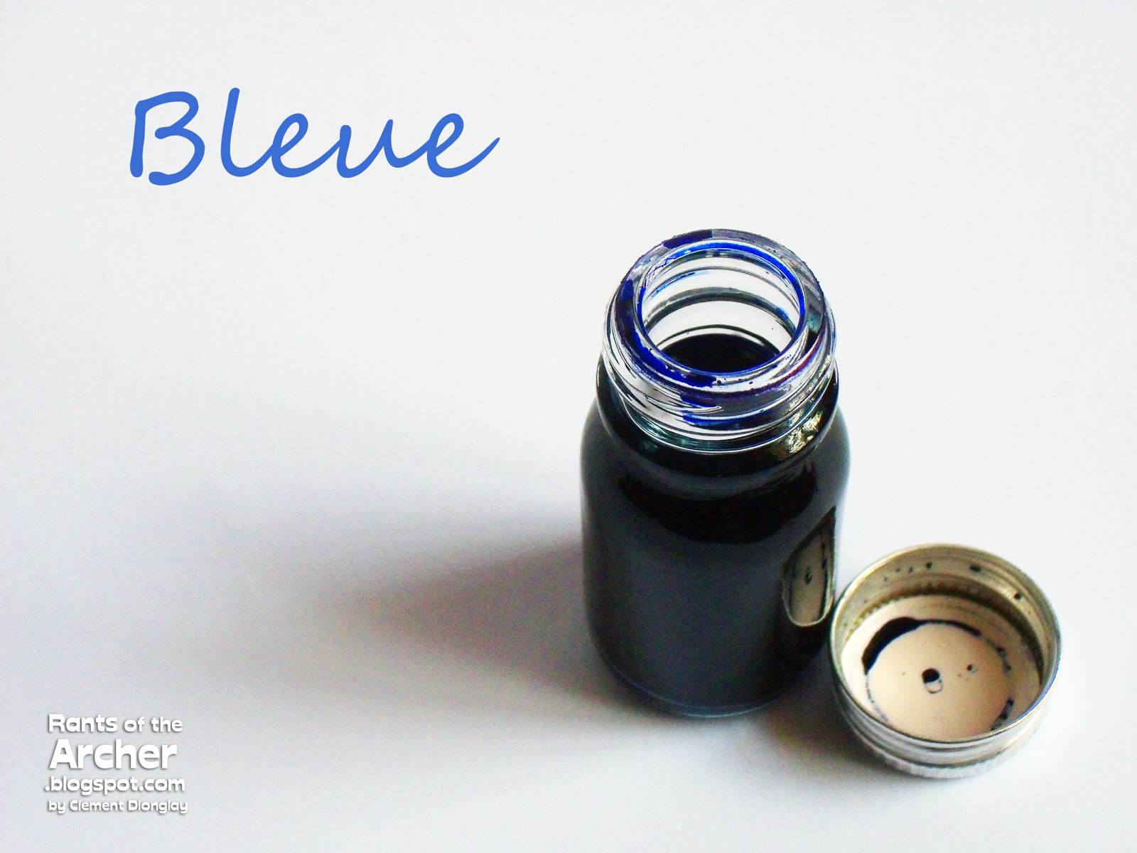

Bleue. An ink set is never complete without a blue, right? This set's blue ink is advertised to be lavender-scented, but I think its scent is a bit strong and quite pungent. When dry, this ink looks somewhat similar to J. Herbin's Bleu Myosotis, a light, grayish blue with hints of purple. I like this blue ink, but the strong scent put me off when I wrote using it. I know I will use it later, but to keep my pens from its strong scent, I will probably use it with my glass dip pen only.


Rouge. The red ink in this set is rose-scented and my favorite among the five for its scent and color. This red ink has a classic rose scent that reminds me so much of my late grandmother's perfume which she used to spray on me, when as a skinny seven-year old, I joined other girls during Flores de Mayo and offered flowers to the Virgin Mary. Whenever I smell this ink, I am taken back to those hot and humid days of May years ago. This ink's scent is not the only reason why it is my favorite. I am partial to red inks and this one became an instant favorite. It looks so much like J. Herbin's Rouge Opera, with the same deep and intense red that I fell in love with a couple of years back. I will definitely keep and use this ink.


Ambre. Next to Rouge, Ambre is also my favorite in terms of color, but I do not like its scent. Ambre is the orange/brown ink in this set and is orange-scented, but like the lavender-scented Bleue, I found the scent a bit strong and overpowering. The color is almost exactly like the brownish-yellow J. Herbin Ambre de Birmanie. This ink also shades well, and probably the only ink in this set to shade as beautifully. 


Violette. This is the purple ink in this set and has the next best scent after the rose-scented Rouge. Scented like violet flowers, this ink has a very pleasant and delicate scent. The color, though, is very bring for me. It still looks lighter than most purple inks in the J. Herbin line, and I will definitely keep and use this ink next to my other purples.


All the five inks in this set wrote well when I tested them. They didn't have any flow or drying issues and all colors looked bright, vibrant, and happy in the 90g Clairefontaine GraF it sketch paper. Among the five inks, only Violette had minor feathering, while the rest behaved well. At first I worried that the scents will bother me, as I am sensitive to scents and perfumes. Surprisingly, they did not bother me at all as their scents are strong only while inside their respective bottles. As soon as they dry out on paper, their scents do not linger anymore.

I love these scented inks from J. Herbin, and I will use them to write to my friends and in my diary. I only wish that the 10ml bottles in the sampler pack had labels in them to indicate their colors (and scents?) and had plastic caps that are easier to twist than the thin metal ones used on them.

Aside from the Les Subtiles set, J. Herbin inks have other ink colors, including a set of their regular 30 ink colors. These water-based inks are non-toxic, have neutral pH and manufactured using natural dyes. A printable PDF of J. Herbin fountain pen ink swatches are available for download here.

The sample set of Les Subtiles ink reviewed here is courtesy of Exaclair, Inc. through Karen Doherty, and also the Clairefontaine GraF it Sketch pad.
Read More
Posted in ink, ink review, inks, J. Herbin, scented inks | No comments

Monday, 12 December 2011

Notebook Review: Banditapple Carnet

Posted on 03:15 by Unknown

I first read about Banditapple Carnet notebooks in June when my friend Julie wrote a review in her blog. Out of curiosity, I sent an email to Banditapple's creator and owner, Arnie Kim, to ask for sample products to review on the blog. Three months of waiting and chasing the guys at our Post Office, I received the lovely notebooks that Arnie sent to me. 

Banditapple Carnet notebooks are sold by its creator and owner, Arnie Kim from Seoul, South Korea, though they are all hand-made in Vietnam. Arnie said that his notebooks are now available in stationery stores not only in South Korea, but also in selected stores in Japan.


The notebooks come in three sizes (Peewee, Handy, and Tablet) and two cover colors (Hanoi Red and Saigon Black). All Banditapple Carnet notebook sizes are available in either blank or ruled paper with 64 pages of acid-free, 80gsm off-white paperstock. The cover used on the notebooks is plain cardstock which makes them look very simple, and almost anonymous and unbranded. But I like that. I'm also glad that Arnie sent me samples of all available notebook sizes and covers, and that he sent me notebooks with both blank and ruled pages.


Peewee in Saigon Black cover with my first generation pink Lamy Safari.


Peewee is the smallest among the three available notebook sizes of Banditapple Carnet. It measures 3.5 x 5.5 inches, sized like a pocket Clairefontaine notebook, Venzi, or Field Notes. The photo below shows the Peewee on top, and all the notebooks I mentioned underneath it. All notebooks have the same dimensions, they just differ in either their binding (stapled or stitched) or corner cuts. Since I received the Banditapple Carnet notebooks, I've made the Peewee my 'ink diary'. It's the perfect thin, small, black notebook I can carry with me anywhere because it fits in the plastic zipper pocket of my Midori TN. When I need to see how a certain ink behaves in a particular pen, I just pull out my Peewee.


Handy in Saigon Black cover with my yellow Lamy Safari.


Handy, the 'middle' size, measures 4.25 x 8.25 inches. This notebook made me very happy as soon as I saw it. Why? Because it's the same size as my Midori Traveler's Notebook's refills! And what's better, the Banditapple Handy have round page corners.

Banditapple Handy in Hanoi Red cover on top, Midori Traveler's Notebook refill below.

See? Banditapple's Handy fits my Midori TN perfectly!


Tablet in Hanoi Red cover, with my LE orange Lamy Safari.


Tablet, the biggest Banditapple notebook, measures 5.125 x 8.25 inches. It is sized like a large Moleskine or Rhodia Webbie, or as shown below, a soft cover large Venzi notebook. I got a blank Banditapple Tablet, and I may just turn it into a sketch/doodle/calligraphy notebook later.

Banditapple Tablet in Hanoi Red cover on top, soft cover Venzi below.


The other wonderful feature of Banditapple Carnet notebooks is their binding — the pages are stitched — not stapled, not glued, but stitched. A single signature is stitched to the cover, and the notebooks' stitching match the color of their covers.

Neat stitching on spine...

...and on the notebook's pages.


And now, the best part about these wonderful notebooks: the paper. Banditapple uses 80gsm off-white (read: not-so-white), acid-free paper. Dr. Matthias Meckel, blogger at Bleistift, wrote that Arnie spent more than two years to find the right paper for his notebooks. And his efforts paid off. Banditapple Carnet notebooks have one of the best papers I've ever tried with my fountain pens.

Banditapple uses a .25 inch page ruling; top margin of .75 inch, and bottom margin of .625 inch. Ruling has been printed using soy type ink.

The pages have no side margins, though. The ruling extends to the edges of the page spread.


And I saved the best for last: the pen and ink tests on Banditapple's Handy notebook. Because the Handy is a tall notebook, I was able to test a couple of pens on a page, including fountain pens, a rollerball, gelpens, and a permanent marker. I like using different pen types to test a notebook's paper because it shows me instantly how the pens and inks react to it.

Banditapple uses paper that is not smooth and shiny white. But it is very excellent for fountain pen use, especially to very broad and wet nibs such as those on my Esterbrook pens. The Esterbrook LJ and Trans J pens below both have 9968 (firm broad) nibs and I did not see any feathering or bleed at all. Even the badly notorious bleeder called Noodler's Midnight Blue behaved so well on this paper. I also noticed that some ink types even showed better color in Banditapple's paper, like Edelstein Jade and J. Herbin Bleu Myosotis. Drying takes a longer time compared to other paper types, but that is just fine.

All in a page: 21 fountain pens, 1 rollerball, 9 gelpens, 1 permanent marker.

Banditapple paper up close. Ink is  J. Herbin Café des îles. I love the pure, cottony goodness of paper on a close shot like this. And even at a very close view, I just don't see the ink feathering on paper.


This is how the back of the pen and ink test page looks like. Not one of the 21 fountain pens bled or feathered, but the Sharpie permanent marker just had to bleed very badly. But that's how Sharpie behaves on almost all of the paper types I have ever tested.

Lastly, here is the Peewee notebook that I have made into an 'ink diary'. Very cool. I like keeping an 'ink diary' because it's a way of keeping an informal inventory of my inks and pens. And I am very strict with myself that whenever I fill a pen, I have to write down the date, ink type, and pen used so I have an ink/pen reference.


If you need more information about these wonderful notebooks, Arnie Kim's contact details are on his site, http://www.banditapple.com/. Or you can email him using this email address: owner@banditapple.com if you want to discuss notebook orders. You can place orders for his notebooks in bulk and he will gladly give you a good price and a choice of whether to ship by air (faster), or water/surface (slower by 2 weeks, but then, the package gets to you). This is the best way of ordering from Arnie at the moment.

I am not affiliated with Banditapple Company, I am just a very satisfied owner of these wonderful and amazing notebooks.

The Banditapple Carnet notebooks used in this review are from the Banditapple Company through its creator and owner, Arnie Kim. The other notebooks, pens and inks used in this review all belong to my personal collection.
Read More
Posted in Banditapple Carnets, fountain pens, inks, notebook review, notebooks, paper, paper review | No comments

Monday, 1 August 2011

Ink Review: Diamine Orange

Posted on 05:45 by Unknown
When you squeeze an orange, orange juice comes out ~ because that's what's inside.

-  Dr. Wayne D. Dyer
(Internationally renowned author and speaker in the field of self-development.)


The past several weeks have been gloomy and dreary from where I am. A number of typhoons and tropical depressions have continuously dumped enormous amounts of water on most parts of the country; for days, dark rain clouds shadowed us in. But as I stayed indoors, I took out my box of inks and found Diamine Orange -- I got a bright, happy ink color for company!


I received Diamine Orange from the first batch of ink samples that Phil Davies sent to me. I didn't like it at first because it's too bright. Then again I realized, what orange ink won't be bright? Point taken, I found a use for it: underscoring my notes and lesson modules. I began filling my wide-nibbed pens with it and Diamine Orange became one of my two favorite ink colors for underscoring.

Diamine Orange is a bright, brilliant, vibrant ink. It is very saturated, like all Diamine inks, but has excellent, smooth flow. Despite its high level of saturation, feathering and bleeding occurs only on a few types of paper (but note that feathering and bleeding are affected by a number of factors). This Diamine ink is very bright orange while wet, but becomes just as bright when it dries.


Named after the ripe orange fruit, orange is a color between yellow and red in the visible spectrum. After several comparisons, Diamine Orange looked to be having just the right amounts of yellow and red, making it an almost-perfect orange color.

True enough, this ink reminds me of ripe oranges, tiny juicy clementines, fragrant satsumas, freshly squeezed OJ, and cold orange marmalade on top of hot, buttered buns.


I tried very hard to capture this ink inside the plastic 30ml bottle. These tall, rectagular plastic bottles are spill-proof because of a simple mechanism inside the cap. I carried Diamine Syrah in a similar bottle in my bag for a day and though it got jostled and tumbled, the ink did not spill at all.

I also noticed that this ink clings to the inside of the plastic bottle, unlike Woodland Green and Majestic Blue that just runs off. The lovely amber-like, orange liquid is just lovely.


In the photo below, the ink looks almost like a fragrant, sweet syrup waiting to be tasted.


Below is Diamine Orange on Kokuyo graph paper. I love Kokuyo paper and use it specifically for my Diamine ink reviews (here and here) because it is resistant to feathering and bleed. For this review, I used a Manuscript 1.5 crisp italic pen for calligraphy and my cadmium yellow Sheaffer No Nonsense with medium nib for regular writing.

When I did the shoot for this review, I needed to pull down the shades in the room to underexpose the following photos. I had to do that to capture the ink color properly. When shot under normal or bright light, this orange ink glows!


I wrote the quote using a 1.5 crisp italic nib, and though I noticed some very faint shading in the end strokes, I cannot say that Diamine Orange has shading.


And it is just the same in my alphabet set. There is very faint shading in the beginning and end strokes of the letters.


But with or without shading, isn't this the most vibrant, happy orange ink in the world? Here is Diamine Orange from my cadmium yellow Sheaffer No Nonsense with a regular round medium nib. This is a very saturated ink, but flows surprisingly smooth on the pens I used for this review. It also dries fast on Kokuyo paper.


Aside from Herbin's Diabolo Menthe, Diamine Orange is only the other ink I use for underscoring. It's such a joy to see my notes and module pages come alive with the different ink colors I use for underscoring and highlighting, though I mostly use my Pelikan M205 ink for highlighting.


I only have two orange fountain pen inks aside from Diamine Orange, and they are J. Herbin Orange Indien and Caran d'Ache Saffron, all happy colors! Orange Indien has more yellow and I use it to color some of my drawings. Caran d'Ache, on the other hand, has more red, and sometimes I use it to write entries on my diary.

Diamine Orange has just the right combination of yellow and red that makes it a bright, happy orange. On a page of white paper, the color just pops out! Aside from underscoring, I also use Diamine Orange to write headings on my notes and comments on my modules. If I need to write something for emphasis, I'll grab a pen with Diamine Orange!

And just because I got a Zebra Sarasa and Pilot Frixion gel pens with orange ink, I included them here too.


Among the Diamine inks I have reviewed, this is the fastest to dry. Both Woodland Green and Majestic Blue took around 26-28 seconds to dry on Kokuyo paper. Diamine Orange took only 13 minutes to dry, which is just half the time it took for either of the two inks to dry.


I like write-testing an ink on different papers. Doing so makes me see how the ink behaves on different masses of pulp.

Up close, here is Diamine Orange on Kokuyo paper.
There is slight feathering here but the ink did not bleed at all.

On Venzi paper. I'm happy to see how beautiful and neat the letters are. There is no feathering, and definitely no bleed! (Must get more of this notebooks.)

Lastly, here it is on Whitelines paper. It's my first time to use Whitelines paper and though there wasn't any feathering, I noticed that the ink bled.

I don't have favorite ink colors, and as I am drawn to brown, and dark shades of blue and red, I also gravitate towards bright, vibrant colors because they brighten my notebook pages. Diamine Orange is a bright, happy ink that I enjoy a lot and brings a smile to my face every time I use it. It makes reviewing fun for me! And though its brightness prevents me from using it for regular writing, I will always find ways to use it.

Founded in London, Diamine has been manufacturing inks since 1864. Diamine is one of the largest producers of a large range of fountain pen inks as well as the famous Registrar's Ink for permanent records. Diamine fountain pen inks are available from the Diamine site or from the Writing Desk in the UK. In the US, they are available from the Goulet Pen Company or the Pear Tree Pen Company. (I have no affiliation with any of these companies.)
Read More
Posted in Diamine, Diamine Orange, ink review, inks, Kokuyo, orange, The Archer | No comments

Tuesday, 25 January 2011

Notepad Review: Rhodia dotPad

Posted on 05:30 by Unknown

Sometime in spring last year, Rhodia introduced a new addition to their line of notepads, and they called it the dotPad. dotPads are "functional black stapled notepads with a dot grid." Yes, the dotPad has dots – not lines, just dots – tiny, subtle purple dots spaced 5mm apart. According to Rhodia, the dotPads are brilliant alternative to traditional lines and boxes found in other notepads, including some of Rhodia's own, and the dot grid is a favorite for graphic designers, architects, artists and everyone looking for a subtle grid.

When Exaclair VP for Marketing Karen Doherty sent me the J. Herbin 1670 Anniversary ink last November, she included a No. 19 Rhodia dotPad which I called Dottie.


The dotPad's ruling system is new to me. I have never tried paper with dot grid before as I always used lined/ruled paper. My Journal is ruled, the notebooks and notepads I've used in my ink reviews are either lined/ruled or squared. The reason why I've always avoided blank paper is that I find it uncomfortable to write on. Now with Dottie, I can write, do calligraphy, and even draw (and color!) without worrying about my handwriting going to wrong directions, or with lines getting in the way of my calligraphy and drawings.


dotPads, like other Rhodia pads, are staple-bound. But unlike its siblings, dotPads have black covers instead of the traditional Rhodia orange. The top of the inside cover is scored so that it will fold back easily towards the back cover, but what it reveals once folded is something so cool to me - the Rhodia logo. A thicker board is placed at the back of the pad, aside from its back cover, to provide it with stronger support.


Dottie has the same smooth, white, acid-free, ph-neutral 80gsm Clairefontaine paper that I have enjoyed using in my previous ink reviews. The pages are microperforated and very easy to tear off. Like many fountain pen users, I prefer using Rhodia pads and notebooks as they are very, very friendly to fountain pen use. It's the perfect paper to use in my ink reviews!

The photo below shows all of the J. Herbin inks I got in my ink stash right now. I used an Herbin glass dip pen to test all 14 inks on a page off my Dottie.


Below are more pen and ink tests on Dottie.

A selection of fountain pens and inks...

Some of my gel pens...

A pencil and a Sharpie.

Look! No bleed! Except for the ultra-fine Sharpie that bleeds on almost anything.


---------------------------------------------------------------

Below are some macro shots of different inks on the dotPad's paper. I realized that this is the perfect paper to test inks because most of the 'featherers' and 'bleeders' on my ink collection behaved beautifully on this paper.

Lovely Herbin inks! See how smooth Rouge Opera and Vert Pré are on the dotPad.

I'm happy to see the red undertones of Diamine Majestic Blue here because it does not always show - my guess is that the paper/pen/ink combination determines such.

Caran d'Ache is sooooo smooth.

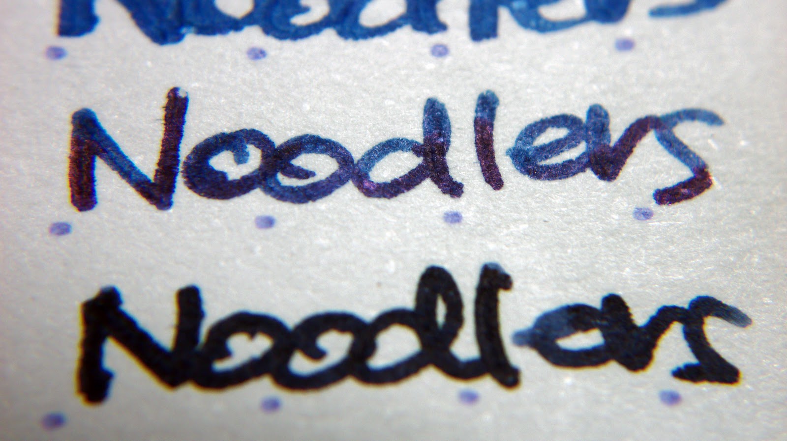
And Noodlers too! I told you they all behaved well - no feathering, no bleeds! Yay!


The dotPad that Karen sent to me is the No. 19, measuring 8¼ × 12½. It is available in four sizes, though: 3 3/8" × 4¾", 6" × 8¼", 8¼" × 12½" and 16½" x 12 ½";  in a number of Rhodia and Exaclair retailers worldwide. Coming up in 2011: a dotted Webbie! Can't wait!


And now for a bit of experiment and fun. Here is a Stegosaurus I drew and colored on a page of my Dottie. I got it from About.com's cartooning for kids section for my niece. I just love the cute smile on this dino's face that I drew one myself. I used a Sharpie ultra-fine pen for dino's outline. Though I have not tried any of my inks for coloring, I used J. Herbin Bleu Pervenche for its body, Orange Indien for the first row of armor plates and tail spikes, and Terre de Feu for the remaining armor plates and its toe nails. I enjoyed coloring this cute dino so much! I felt like a kindergarten kid again!


Rhodia dotPads are available in different sizes to fit everyone's lifestyle. Use it for note-taking, writing lists, doing calligraphy, sketching, drawing, painting, and so on. The possibilities with these pads are endless!
Read More
Posted in Caran d'Ache, Diamine, dotPad, Exaclair, inks, J. Herbin, Karen Doherty, Noodlers, paper review, Rhodia | No comments
Older Posts Home
Subscribe to: Posts (Atom)

Popular Posts

  • Notebook Review: Clairefontaine Basics Clothbound Notebook
    When I received the package that Karen Doherty of Exaclair sent me in September, I liked everything in it except a black, plain notebook. ...
  • Pen Review: Schneider iD Fountain Pen
    I love Schneider pens. I have a huuuge stash of Schneider gel pens, fineliners, and rollerballs hoarded collected before I shifted to fou...
  • Ink Review: J. Herbin 1670 Ink
    Red was your colour. If not red, then white. But red Was what you wrapped around you. Blood-red. Was it blood? Was it red-ochre, for warming...
  • Review: Unlimited Notebook by Rhodia
    When I received these Rhodia UNLIMITED notebooks that Karen Doherty sent to me last year, I asked her why they're called UNLIMITED. Kar...
  • Fountain Pen Review: Lamy Safari 2012 Limited Edition Green
    When I started using fountain pens in 2007, I was like any other newbie. I hoarded. I had no clear idea of what I really want and got pens I...
  • Ink Review: Sailor Jentle Grenade
    O drops of me! trickle, slow drops, candid, from me falling — drip, bleeding drops, ~ From "Trickle, Drops" by Walt Whitman One of...
  • Fountain Pen Review: Sheaffer Taranis
    Sheaffer celebrates their Centennial Year - 2013 - with a fleet of writing instruments including super limited edition pens and two new seri...
  • Oh, No...
    Oh, no. Not him, please... Actor Morgan Freeman is injured in car accident.
  • For Winter, Let's Have Cold Horizon
    (Courtesy of Bryan Bedell /  fieldnotesbrand.com ) And Field Notes has done it again. Wow me with their notebooks, that is. 2013's Wint...
  • An Idea Gone Wild and Wilder Gets Scrapped
    It is quite obvious that the last two months of my life is far from blissful. I really do not know for sure how I get by. People may shun me...

Categories

  • 1670 ink
  • 2012 Green
  • 2046
  • Aboitiz 2Go
  • Activebook
  • Agatha Ruiz de la Prada
  • Alice Wu
  • Ambre de Birmanie
  • Andy Garcia
  • aneurysm
  • Apple
  • Apple Green
  • Aquamarine Lamy Safari
  • Arthur Golden
  • asthma
  • Aurora
  • Aurora Blue
  • AV malformation
  • Banditapple Carnets
  • Bandzug
  • Baoer
  • beautiful things
  • Beijing Olympics souvenir
  • Bejewelled
  • Bench
  • Berroca
  • Binondo
  • birthdays
  • black
  • Bleu Pervenche
  • Blistex
  • blog advertising
  • blogging
  • blue
  • blue inks
  • blue notebooks
  • Body Shop
  • Books
  • Brause
  • Bridges of Madison County
  • broad
  • broad nibs
  • calligraphy
  • Camel Scarlet Red
  • Camlin Trinity
  • Caramoan
  • Caran d'Ache
  • Caran d'Ache Saffron
  • Cararama
  • Carnival of Pen Pencil and Paper
  • cars
  • Cattleya
  • Chelpark Moti
  • ChoroQ
  • Christmas
  • Chuck Taylor
  • Clairefontaine
  • Clint Eastwood
  • coffee
  • Coleto
  • Colibri
  • collecting
  • colors
  • Corgi
  • Corona notebooks
  • Cosmos Bazaar
  • Creative Zen
  • Cross
  • Daiso
  • Danitrio
  • Daycraft Juicy Notebook
  • Daycraft Notebook
  • Daycraft Signature
  • Daycraft Signature Notebook
  • De Atramentis
  • Diabolo Menthe
  • Diamine
  • Diamine Majestic Blue
  • Diamine Orange
  • Diana Krall
  • Diary
  • Dickies
  • Diesel
  • DKNY
  • dotPad
  • Eagle notebooks
  • Earl Grey
  • eBay
  • Edelstein
  • Effen Vodka
  • elephant
  • elephants
  • envelope
  • Esterbrook
  • Euro Office
  • Evanescence
  • Exaclair
  • Exacompta
  • ferris wheel
  • Field Notes
  • fire trucks
  • firetrucks
  • folder
  • food
  • Foray
  • fountain pen
  • fountain pen ink
  • fountain pen review
  • fountain pens
  • FPN-P
  • Frank
  • Fully Booked
  • G. Lalo
  • garage
  • gel pens
  • get paid to blog
  • GPW
  • Grandluxe
  • grassheads
  • Green
  • grid notebook
  • GTD
  • handwriting
  • Haolilai
  • Hard Rock
  • Haruki Murakami
  • health
  • hearbreak
  • heartbreak
  • Hero 221
  • Hero pens
  • Hero616
  • hobby
  • Ikea
  • Il Divo
  • ink
  • ink review
  • inks
  • Inoxcrom
  • iPaq
  • iPod mini
  • iron gall ink
  • J. Herbin
  • J. Herbin Rouille d'Ancré
  • James Blunt
  • James Patterson
  • Japanese ink
  • Jentle
  • Jinhao
  • Joan Chen
  • Jollibee
  • Journal
  • Kaj Stenvall
  • Karen Doherty
  • Kokuyo
  • Kramer vs. Kramer
  • Kultur
  • LA Gear
  • Laban
  • Lamy
  • Lamy Al-Star
  • Lamy Blue Black
  • Lamy Joy
  • Lamy Logo
  • Lamy Nexx
  • Lamy Safari
  • Lamy Safari Neon
  • Larmes de Cassis
  • leather
  • Lee
  • lesbianism
  • Lierre Sauvage
  • life
  • Limited Edition
  • lined notebook
  • lip gloss
  • love
  • Lynn Chen
  • Lyons
  • Mahatma Gandhi
  • Maisto
  • Majestic Blue
  • Manila
  • Manuscript
  • Master
  • Matchbox
  • Memoirs of A Geisha
  • Mesaki
  • Miami Ink
  • Michael Jackson
  • Michelle Krusiec
  • Midori
  • Midori Traveler's Notebook
  • migraine
  • Moleskine
  • MonAmi
  • Mont Blanc
  • Moore
  • Movies
  • MRA
  • MRI
  • Music
  • NaNoWriMo
  • National Bookstore
  • neon
  • new product
  • nib
  • nibs
  • Nike
  • Nokia
  • Noodler's
  • Noodlers
  • Norah Jones
  • notebook
  • notebook review
  • notebooks
  • notepad
  • novels
  • office stationery
  • office supplies
  • orange
  • Orange Indien
  • Osmiroid
  • Oxblood
  • Pablo Neruda
  • paper
  • paper review
  • Parker
  • Parker Penman
  • Parker Quink
  • Parker Rialto
  • Paulo Coelho
  • Pelikan
  • Pelikano Junior
  • pen and ink
  • pen holder
  • pen holders
  • pen review
  • pencils
  • Penman inks
  • pens
  • perfume
  • Phillips
  • Pilot 78G
  • Pilot Coleto
  • Pilot FriXion Ball
  • Pilot G2
  • Pilot GTEC
  • Pilot H32 mechanical pencil
  • Pilot pens
  • Pilot Petit
  • pink
  • planner
  • Platignum
  • Platinum Preppy
  • pocket notebook
  • poetry
  • police cars
  • polyurethane
  • Poppin
  • postcards
  • Postcrossing
  • Poussière de Lune
  • Private Reserve
  • Private Reserve Avacado
  • Private Reserve Copper Burst
  • product review
  • Pukka
  • Quiver
  • Quo Vadis
  • Quo Vadis Habana
  • reading
  • red
  • Red Dragon
  • red ink
  • reecovid
  • Retro 51
  • review
  • reviews
  • Rhodia
  • Ricky Martin
  • RJ100
  • Robert James Waller
  • Rocket Dog
  • Rotring
  • Rouge Opera
  • round corner
  • Safari
  • Saffron
  • Sailor
  • Samsung
  • San Francisco Bridge
  • Saving Face
  • scented inks
  • Schneider Base
  • Schneider iD
  • Schneider pens
  • Scribe
  • Scribe Writing Essentials
  • Scriptmaster II Series Mary Ann
  • Sharpie
  • Sheaffer
  • Sheaffer Taranis
  • shopping cart
  • shotglass
  • shotglasses
  • Siku
  • Simpsons
  • sleep
  • Somersby
  • Songs
  • Sony Ericsson
  • Staedtler
  • stamps
  • Starbucks
  • Sterling notebooks
  • Stradmore
  • stub nibs
  • stubs
  • Stypen
  • Symbicort
  • Syrah
  • Taranis
  • Tazo
  • Terre de Feu
  • Text Twist
  • The Archer
  • The Burns Sisters
  • The Graduate
  • The L Word
  • thyroidectomy
  • Timbuk2
  • TOMICA
  • TOMY
  • toy trucks
  • toys
  • turquoise
  • TWSBI
  • TWSBI notebook
  • typhoon
  • Uni-Ball
  • Uni-Ball Signo Gelstick
  • Ventolin
  • Visconti
  • Wality
  • water resistance test
  • Waterman
  • Waterman South Sea Blue
  • white fountain pens
  • Whitelines
  • Wong Kar Wai
  • Write-Now
  • writing
  • yellow
  • Youth pens
  • Zebra Jimnie
  • Zippi

Blog Archive

  • ▼  2013 (10)
    • ▼  November (1)
      • For Winter, Let's Have Cold Horizon
    • ►  September (1)
    • ►  June (2)
    • ►  May (1)
    • ►  April (1)
    • ►  March (1)
    • ►  February (3)
  • ►  2012 (5)
    • ►  November (1)
    • ►  June (2)
    • ►  February (1)
    • ►  January (1)
  • ►  2011 (16)
    • ►  December (1)
    • ►  November (1)
    • ►  October (2)
    • ►  August (3)
    • ►  July (1)
    • ►  June (2)
    • ►  May (1)
    • ►  April (2)
    • ►  February (1)
    • ►  January (2)
  • ►  2010 (17)
    • ►  November (2)
    • ►  August (3)
    • ►  July (1)
    • ►  June (2)
    • ►  May (1)
    • ►  April (1)
    • ►  March (3)
    • ►  February (3)
    • ►  January (1)
  • ►  2009 (51)
    • ►  December (1)
    • ►  November (1)
    • ►  October (7)
    • ►  September (3)
    • ►  August (5)
    • ►  July (5)
    • ►  June (6)
    • ►  May (5)
    • ►  April (6)
    • ►  March (3)
    • ►  February (6)
    • ►  January (3)
  • ►  2008 (107)
    • ►  December (1)
    • ►  November (5)
    • ►  October (4)
    • ►  September (14)
    • ►  August (10)
    • ►  July (21)
    • ►  June (10)
    • ►  May (4)
    • ►  April (9)
    • ►  March (10)
    • ►  February (12)
    • ►  January (7)
  • ►  2007 (48)
    • ►  December (1)
    • ►  November (3)
    • ►  October (9)
    • ►  September (10)
    • ►  August (3)
    • ►  June (6)
    • ►  May (4)
    • ►  April (3)
    • ►  March (3)
    • ►  February (5)
    • ►  January (1)
  • ►  2006 (6)
    • ►  August (6)
Powered by Blogger.

About Me

Unknown
View my complete profile