Notebook Info

  • Subscribe to our RSS feed.
  • Twitter
  • StumbleUpon
  • Reddit
  • Facebook
  • Digg
Showing posts with label J. Herbin. Show all posts

Saturday, 3 November 2012

Review: J. Herbin Scented Inks

Posted on 08:15 by Unknown

A few months ago, I received a small box from Karen Doherty, Exaclair USA's Vice President for Marketing. Inside the box was a large Rhodia dotPad and a set of J. Herbin's Les Subtiles (The Subtle) inks. I wasn't aware then that those were scented inks and just stowed them away in my ink cabinet. When I rediscovered the set a few weeks ago, and realized that I have five bottles of scented ink, I knew that I had to write a review about them.


The J. Herbin website says that these scented inks are made from hydrosols (floral water) of rose, orange, lavender, apple, and violets. The hydrosols are from Grasse, France, a Provencal town long associated with the perfume industry and famous for its floral scents. These inks are safe for fountain pens as they are naturally scented and do not contain pigments.


The set has five inks with different scents and colors. Green apple for Vert/Verte (green), lavender for Bleue (blue), rose for Rouge (red), orange for Ambre (orange/brown), and violet for Violette (purple). The inks are presented in clear 10ml bottles with shiny, silver metal caps. These are also available in individual 30ml semi-frosted bottles.


The J. Herbin Les Subtiles sampler set, clockwise from top: Vert/Verte, Bleue, Rouge, Ambre, and Violette.


Vert/Verte. The green ink in this set is scented green apple but smells sweet like green apple Jelly Belly candies. It has a vibrant green color which is very similar to J. Herbin's Vert Pré — a happy, refreshing green that is not too yellow or too blue. In a wide and wet nib, it is a serious dark green, but changes into bright, highlighter green in a fine nib. I don't have many green inks, and I like this one, I will definitely include this in my rotation.
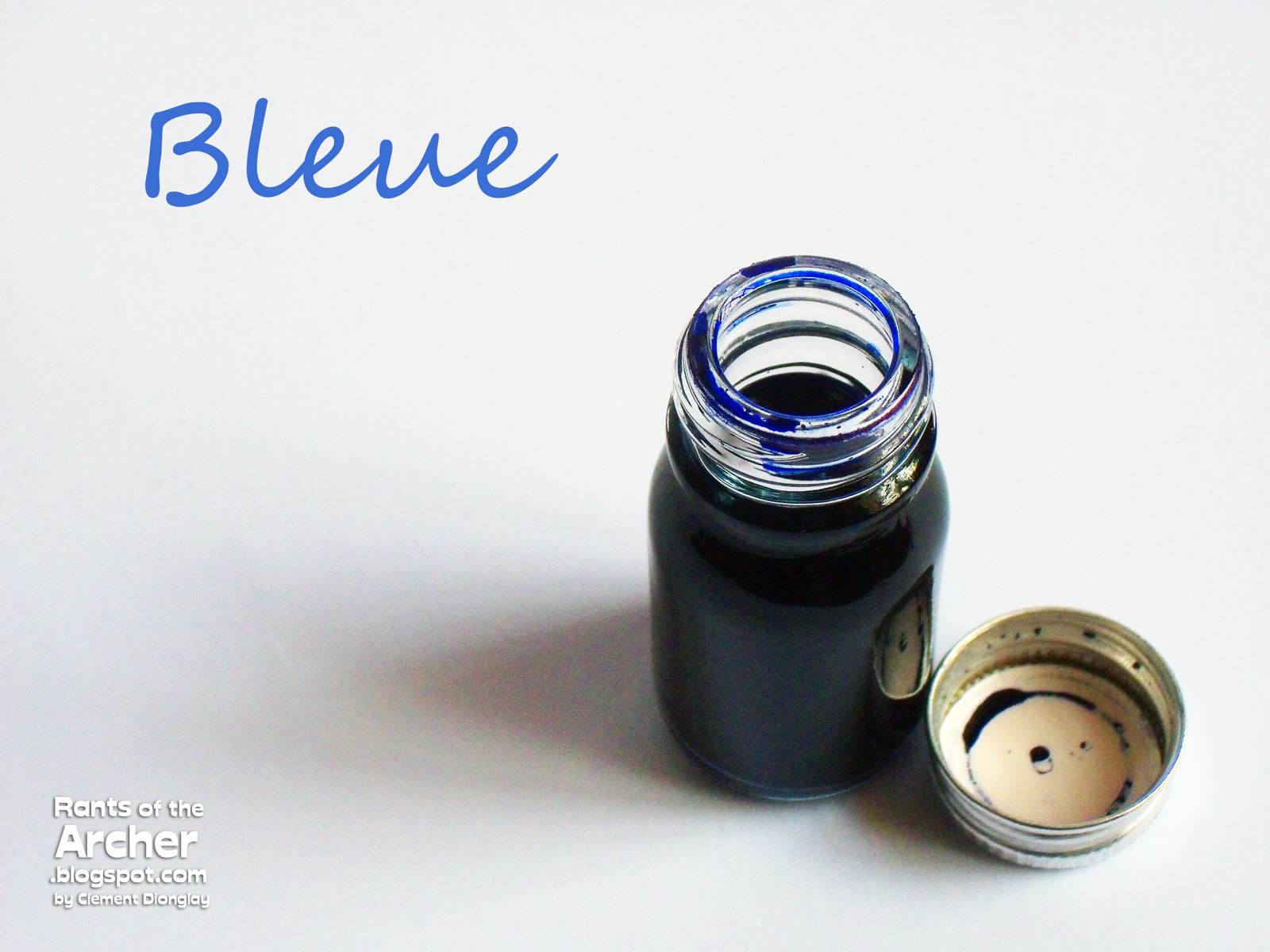

Bleue. An ink set is never complete without a blue, right? This set's blue ink is advertised to be lavender-scented, but I think its scent is a bit strong and quite pungent. When dry, this ink looks somewhat similar to J. Herbin's Bleu Myosotis, a light, grayish blue with hints of purple. I like this blue ink, but the strong scent put me off when I wrote using it. I know I will use it later, but to keep my pens from its strong scent, I will probably use it with my glass dip pen only.


Rouge. The red ink in this set is rose-scented and my favorite among the five for its scent and color. This red ink has a classic rose scent that reminds me so much of my late grandmother's perfume which she used to spray on me, when as a skinny seven-year old, I joined other girls during Flores de Mayo and offered flowers to the Virgin Mary. Whenever I smell this ink, I am taken back to those hot and humid days of May years ago. This ink's scent is not the only reason why it is my favorite. I am partial to red inks and this one became an instant favorite. It looks so much like J. Herbin's Rouge Opera, with the same deep and intense red that I fell in love with a couple of years back. I will definitely keep and use this ink.


Ambre. Next to Rouge, Ambre is also my favorite in terms of color, but I do not like its scent. Ambre is the orange/brown ink in this set and is orange-scented, but like the lavender-scented Bleue, I found the scent a bit strong and overpowering. The color is almost exactly like the brownish-yellow J. Herbin Ambre de Birmanie. This ink also shades well, and probably the only ink in this set to shade as beautifully. 


Violette. This is the purple ink in this set and has the next best scent after the rose-scented Rouge. Scented like violet flowers, this ink has a very pleasant and delicate scent. The color, though, is very bring for me. It still looks lighter than most purple inks in the J. Herbin line, and I will definitely keep and use this ink next to my other purples.


All the five inks in this set wrote well when I tested them. They didn't have any flow or drying issues and all colors looked bright, vibrant, and happy in the 90g Clairefontaine GraF it sketch paper. Among the five inks, only Violette had minor feathering, while the rest behaved well. At first I worried that the scents will bother me, as I am sensitive to scents and perfumes. Surprisingly, they did not bother me at all as their scents are strong only while inside their respective bottles. As soon as they dry out on paper, their scents do not linger anymore.

I love these scented inks from J. Herbin, and I will use them to write to my friends and in my diary. I only wish that the 10ml bottles in the sampler pack had labels in them to indicate their colors (and scents?) and had plastic caps that are easier to twist than the thin metal ones used on them.

Aside from the Les Subtiles set, J. Herbin inks have other ink colors, including a set of their regular 30 ink colors. These water-based inks are non-toxic, have neutral pH and manufactured using natural dyes. A printable PDF of J. Herbin fountain pen ink swatches are available for download here.

The sample set of Les Subtiles ink reviewed here is courtesy of Exaclair, Inc. through Karen Doherty, and also the Clairefontaine GraF it Sketch pad.
Read More
Posted in ink, ink review, inks, J. Herbin, scented inks | No comments

Wednesday, 13 June 2012

Fountain Pen Review: Lamy Safari 2012 Limited Edition Green

Posted on 21:15 by Unknown

When I started using fountain pens in 2007, I was like any other newbie. I hoarded. I had no clear idea of what I really want and got pens I could just easily get. Lately, though, I decided to focus on pens that work well for me, rather than settle on what I just like. I let go of some pens, and now maintain a few sets that include my Lamy Safari fountain pens. I have 14 Lamy fountain pens as of this writing, and my most recent is the 2012 limited edition Green Safari.

Green is Lamy Safari’s 2012 limited edition color and is available as ballpoint, rollerball, or fountain pen. Lamy's authorized distributor in the Philippines, Times Trading, through the kindness of Charlene Ngo, sent me a fountain pen to review. When the pen was delivered to my office on a Monday morning, a lot of people were in awe of this  vibrant, lovely pen.

The Green Lamy Safari fountain pen comes in a self-covered plastic box. You push the sides away from each other and the pen inside the box is shown, held securely in place by a plastic clamp. This box is so Lamy, don’t you think? It is simple, with Lamy’s logo as its only embellishment, but very functional. I like the plastic clamp because while it holds the pen in place, it does not scratch it at all.


Lamy Safari pens are made from sturdy ABS plastic, a common thermoplastic widely used in a variety of products. It is also used in Lego blocks and the inner walls of our refrigerators! The first Lamy Safari fountain pen, the Savannah, was introduced during the 1980 Frankfurt exhibition. It was designed by Wolfgang Fabian and the Mannheim Development Group under the direction of Prof. Bernt Spiegel. Lamy has kept the Safari in regular production since then. To read more about the Safari's history, visit Lamy's website here.


Below is the Green Safari fountain pen’s major parts: cap, section with converter, and barrel. The Green Lamy Safari fountain pen measures 5.5 inches while capped, 5 inches without the cap, and 6.5 inches when posted. It is a light weight pen, and I can use it for extended periods of writing. The cap with the oversized chrome-coated stainless steel clip is 2.5 inches long, the length from the nib to converter is 4.6 inches, while the barrel measures about 3 inches.


Lamy Safari pens, especially the rollerball and fountain pens, have cap buttons, a unique feature of this line. Rollerball pens have a line, and fountain pens have a cross sign in their cap buttons. The Greenfountain pen’s cap button is green like the rest of its parts, though not as glossy, and similar to last year’s limited edition pen (Aquamarine) and the re-issued pink Safari. It is different from the black cap buttons of Safaris in regular production (glossy white, glossy black, matte black, blue, red, yellow).


Here is the Green Safari together with other limited edition Lamy Safari fountain pens in my collection. Farthest right is the earliest pen in the pack, the Lime Green Safari issued in 2008 with the black cap button and cross. Next to it are the Crème Orange (2009) and Pink (2010) Safari fountain pens that have simple dots as cap tops in the same barrel and cap colors, instead of the usual cross on black. The two pens to the left are the Aquamarine (2011) and Green (2012) Safari fountain pens. Last year's group photo is here.


Many fountain pen users frowned at Lamy Safari fountain pen’s triangular grip, finding it uncomfortable and annoying. The triangular grip in the pen’s section however, is designed to make writing easier – it is meant for users to have a firm and secure grip on the pen. Near the end of the section is the anti-slipping brake to prevent a user’s fingers to slip into the nib while writing. I do not find the triangular grip uncomfortable at all. I actually do not notice it!


The Safari fountain pen’s barrel has an ink window that allows me to check on my pen’s ink level without having to screw out the barrel.


Lamy’s proprietary Z24 converters are used to fill the Safari with ink from a bottle. T10 Cartridges are also available, but a Z24 converter comes when you buy a new pen. A pair of nipples on the converter’s sides fit snugly into the small grooves in the upper part of the pen’s section. They fit perfectly so that the converter will not easily turn inside the barrel or be accidentally pulled out of the section. Photos showing more details of the Z24 converter nipples are available here.


The other reason why I love my Safari fountain pens is the interchangeability of their nibs. My Green Safari fountain pen uses the same feed and nib as those on the Lamy Vista, Al-Star, Joy, Nexx, and Studio. The default nib on Safari fountain pens bought in the Philippines is medium, which is my preference, but other nib sizes are available: extra-fine, fine, broad, and left-handed. It can also be fitted with an italic nib ranging from 1.1mm to 1.9mm since the Safari shares the same section, feed, nib, and cap designs with that of the Joy, Lamy’s own set of calligraphy pens. I have seen yellow Safaris fitted with 1.5mm or 1.9mm nibs to be used as highlighter pens. Lamy’s nibs tend to write wide, but they write wet and smooth.


As an old practice with new fountain pens, I flushed this one before filling it to ensure that there is no factory residue or ink on it. After filling it, the pen wrote instantly, and did not need any strong pressure to start writing. It kept writing very smoothly and did not even skip as I filled a page in my pocket Venzi notebook.

Below is my writing sample of this vibrant Lamy Safari Green fountain pen. The ink I used here is an equally vibrant green ink, J. Herbin's Vert Pré.


I love how I can easily swap nibs in my Safari pens. When I received this Green Safari fountain pen, it was just in time for my 'Pentangelized' Lamy stub nib to arrive. It was a joy to have the stub nib on my new pen, as it is so much different from a regular round nib. Pentageli is a dear friend and fellow fountain pen user/collector Jose Reinoso. He is based in Manila, Philippines, and started doing nib work as special favors to his friends. He now accepts minor pen repair work and nib grinding jobs. He fixes barrel cracks using empty shell casings, and has amazingly converted a TWSBI 530 extra fine nib to a juicy, wet flexible!  Photos of his works can be found here, here, and here.


Many followers frowned at Lamy's choice of color for 2012 because two green Safaris have already been issued previously: the original Safari (Savannah) and 2008's lime green. I only have the lime green fountain pen for comparison, and I think the new Green Safari is a beautiful addition to Lamy's growing stable of pens. Next to the new Green, 2008's lime green fountain pen looks more yellow than lime.


This Green Lamy Safari is another cool addition to Lamy's growing line of fountain pens. A beginner's fountain pen, with others even calling it a student pen, this plastic pen actually feels very good in my hand because it is light, but strong and firm at the same time. And it comes in many different colors! My Aquamarine pen still feels new and now I have the 2012 Green Safari in my hands. It makes me dream of the 2013 Safari color. Purple! I want purple! A purple pen would be a nice addition to the pens below, right?


Lamy Safari pens are widely available in reputable pen sellers worldwide. For a global search of Lamy sellers worldwide, follow this link.

In the Philippines, the Green Lamy Safari (and other Lamy pens and ink) is  made available by Times Trading Company, through their increasing number of kiosks at National Bookstore outlets around Metro Manila. Lamy pens are also available at Scribe Writing Essentials, a specialty store offering unique paper products and writing tools located at Eastwood Mall in Quezon City. A Lamy Safari (including the Green pen) fountain pen sells for PhP1,499.75 (~USD35).
Read More
Posted in 2012 Green, Apple Green, fountain pen, fountain pen review, Green, ink, J. Herbin, Lamy, Lamy Safari, Limited Edition, nib, review, Safari | No comments

Monday, 27 February 2012

Ink Review: J. Herbin Ambre de Birmanie

Posted on 20:59 by Unknown

I miss writing ink reviews, really. I was supposed to write one for Valentine's, but the occasion felt too frivolous so I skipped it and chose a different ink color. I saved the red ink for the dark rainy days. One Saturday morning, when the sun was out and shining, I dragged myself out of bed and arranged a photo shoot for this lovely J. Herbin ink called Ambre de Birmanie (Amber of Burma).


J. Herbin's Ambre de Birmanie is a bright yellow-orange to light golden brown ink that looks like Burmite amber, the gemstone that it was named after. Like Diabolo Menthe, it appears light while wet, but turns a beautiful gem-like amber once it dries. This ink is not highly saturated, has excellent flow and beautiful shading especially when used with a wider nib.


Ambre de Birmanie reminds me of the sweet caramel syrup on top of the tall vanilla ice cream that my niece Raiyah and I love to share at McDonald's on our Sunday afternoon dates. I also remember that it looks a lot like the raw honey on thick honeycombs that my brothers and I used to get from a hive in our backyard when we were kids. 


I almost gave up on this ink the first time I used it. The pen I filled with it has a fine nib and the writing sample  did not look any good. I tried it next on my yellow Lamy Safari with a medium nib, and it wrote so good!

Though Ambre de Birmanie is a lovely ink, very few reviews were written about it, and I think I understand why -- not everyone likes a bright yellow-orange ink on their notebooks' pages. And I feel the same way too, but I love using this ink to write  notes on almost everything -- my modules, things to do, important dates, reminders, anything! Bright colors can quickly catch my eye and I like to use them in my planner and journal notebooks to complement the dark inks on their pages. It's also an excellent ink for calligraphy because it produces so much shading.


Clearly, Ambre de Birmanie works well with wide nibs. I wrote the Murakami quote with the 1.5mm italic nib on my Lamy Joy, and the shading I saw when the ink dried is just amazing! I didn't expect a light-colored ink to produce this type of shading. 


And for my usual ink concerns regarding feathering and bleed, I am happy that Ambre de Birmanie did not feather at all on Muji paper. Here, the ink's yellow-orange color is simply outstanding!


But what's even more amazing is that even on a wide nib such as an italic 1.5mm, Ambre de Birmanie did not bleed! There is some show-through, but that's fine with me.


Ambre de Birmanie's drying time does not differ that much from most J. Herbin inks. It dries fast, taking no more than 15 seconds to dry on Muji paper, with the ink coming from a medium Lamy Safari nib.


I mentioned earlier that Ambre de Birmanie is an excellent ink for calligraphy so I tried it on a quote from Sir Winston Churchill. The color is very beautiful. When I look at the page, I pretend that I wrote it using my Herbin glass pen dipped in sweet caramel syrup.


Below are some macro shots of Ambre de Birmanie on Muji paper. These were written using a Lamy Joy with 1.5mm italic nib. This ink is beautiful on white paper. Its cheery color stands out of the bright white page. It doesn't look as good on cream or beige paper, though.


Amber is fossilized tree resin which has been appreciated for its color and natural beauty since Neolithic times. It is primarily found in the Baltic regions, but also appears in the Dominican Republic, Mexico, Burma (now Myanmar), Italy, Romania, Borneo, New Zealand, the Middle East, Alaska, Canada and the United States. Hilltribe women from the Kachin State are known to wear long, crayon-shaped pieces of the unique orange-red Burmite amber found there.

Could it be possible that J. Herbin passed through Burma during his travels? If so, it may be in Burma where he saw the beautiful yellow-orange color and named it Ambre de Birmanie -- Amber of Burma, after the land's beautiful amber.


J. Herbin inks are available in 30 beautiful colors. These water-based inks are non-toxic, have neutral pH and manufactured using natural dyes. Download a printable PDF of the J. Herbin fountain pen ink swatches here.

A 30ml bottle of J. Herbin ink sells for P475 at Scribe Writing Essentials here in the Philippines, and US$9.75at The Goulet Pen Company. (I am not affiliated with either companies.)

The bottle of Ambre de Birmanie reviewed here is courtesy of Exaclair, Inc. through Karen Doherty, while the Muji notebook and Lamy pens (Safari, Joy) all belong to my personal collection.
Read More
Posted in Ambre de Birmanie, calligraphy, fountain pen, ink, ink review, J. Herbin, Lamy, Lamy Joy, yellow | No comments

Sunday, 20 November 2011

Notebook Review: Quo Vadis Keith Haring Artist Series

Posted on 05:15 by Unknown

I have a lot of notebooks. I actually have an insane number of them inside my 'notebook cabinet'. While some are from my impulse buys, most of them came from my silent sponsors, as samples for review. I'm fascinated by colorful things, but I have always been fond of plain-covered notebooks. I like using any black-covered ones for journal writing and note taking. I also use a small black notebook for the 'ink diary' that I keep (more on that on the next notebook review). 

When I received the Keith Haring Quo Vadis Habana notebooks that Karen Doherty (Exaclair's USA VP for   Marketing) sent to me a few months ago, it wasn't exactly love at first sight. Late last month, while I was sick and recovering at home, I saw the notebooks again and decided to try them out. That time, though, it was definitely love at first write.

Keith Haring Habana notebooks are the most recent addition to the Quo Vadis limited edition Artist Series that include the art of Pablo Picasso and Henry Matisse. Picasso's "Portrait of Dora Maar" and Matisse's "Icarus" and "The Creole Dancer" are the selected cover designs of their respective series.

Keith Haring's "Earth Day" and "Baby" on small Quo Vadis Habana notebooks.


These Keith Haring Habana notebooks, as with the other notebooks in the Quo Vadis' Artist Series, are made in France, with leather-like cover material which I love because they are soft, not very smooth, and not shiny either. This leather-like material is wrapped on what I assume is thick board, making the cover solid. The firm, solid covers of Quo Vadis Habana notebooks are made to provide writing support. Photo below shows the notebooks' back covers, printed with Keith Haring icons in the middle, while the Quo Vadis logo is etched in the bottom.


Quo Vadis made Keith Haring Habana notebooks in four designs and two sizes. The four designs are: 'Baby', 'Heart', 'Earth Day', and 'La Ronde'. They are available as either small (4" x 6") or large (6¼" x 9½") notebooks. Both Haring Habanas used in this review are small notebooks.

"Earth Day" is only available in small (4" x 6") size.

"Heart", though, comes in small (4" x 6") and large (6¼" x 9½") sizes.


The Keith Haring Habana notebooks have the same features as their regular counterparts: they have the elegant page ribbons/markers and elastic closures in matching colors. Soon I'll be tying the end of the page ribbons into knots to prevent ugly fraying.

Keith Haring's signature is printed in white on the notebooks' front covers. How elegant.


The small Haring Habana notebooks have 96 sheets of very smoooooth satin ivory paper. The pages have 5.5mm ruling, a welcome change from the wide 8mm ruling previously used on both large and small Habana notebooks. The pages have round corners too, which is great. I prefer notebooks with round corners because sharp page corners can sometimes cut into my fingers and palms when I'm writing. Round corners also look more elegant and stylish.

Round page corners of the Haring Habana notebooks.


Another wonderful feature of Quo Vadis Habana notebooks, including the Haring Habanas, is their sewn binding. This ensures more page security and flexibility, and also (again) adds to the notebooks' elegance. Sewn binding is so much better than most punch and bind methods because the pages are more secure and also tidy.

Sewn pages of the small Haring Habana notebooks.


These special Habana notebooks have lovely spines printed with Keith Haring's signature and icon. Definitely a welcome change from the old, plain spines of my previous notebooks.

The Haring Habana notebooks have printed spines.


The Habana's "small" is not the same in size as the "pocket" of other notebook brands, which is always misunderstood by many users who think that the two sizes are interchangeable. "Small" and "pocket" sizes are not the same. Several brands share the same "pocket" size, such as Moleskine and Rhodia, and Scribe here in the Philippines, while Quo Vadis uses the "small" size alone.

Size comparison: Two pocket notebooks on top, Moleskine and Rhodia. 
The two notebooks below are regular Rhodia and Keith Haring Habana.


I mentioned earlier that the Haring Habanas have smooth satin ivory paper. It is really very, very smoooooth but I did not have any difficulty writing on it. In fact, the smoothness made writing very easy and comfortable, compared to other overly smooth paper types that make writing uncomfortable. I also noticed that while the ruling in the old Habana notebook pages went all the way to the binding, it has a certain margin in the new notebooks.

If paper can make people happy, the Haring Habanas' paper will. 
I know because the smooth satin ivory paper made me happy.


Unlike the previous Habana notebooks with continuous lines, the Haring Habanas have dotted lines. But that's fine. The dotted lines didn't get in the way of my writing, or with the readability of what I've written. I actually think this is cool.

Haring Habana page up close. See the dotted lines?


Below is a page devoted to pen and ink tests, and I included gelpens, felt markers, and a permanent marker in the list to fully test the paper. All the fountain pen inks I tested on the Haring Habana fared very well. I did not see any serious feathering or bleed, even with the notorious bleeder, Noodler's Midnight Blue. I also used a couple of pens with broad Esterbrook nibs such as the Transitional J with Private Reserve Black Magic Blue and J pen with J. Herbin Lierre Sauvage. This is good news, and it made me very happy.

The "non-fountain pen" pens I used in the pen and ink test include Pilot G2s, Stabilo felt markers, Zebra Sarasas, and a Sharpie Ultra Fine Permanent Marker. All the other pens wrote well without feathering or bleed, except for the Sharpie which feathered and bled like an open faucet. But that's just okay. Sharpies bleed bad on most papers.

Inks on the Haring Habana up close: Waterman South Sea Blue, Pelikan Blue Black, 
Private Reserve Black Magic Blue, and Pelikan Edelstein Jade.

The "non-fountain pen" pens: Pilot G2, Stabilo, Zebra Sarasa, 
and Sharpie Ultra Fine Permanent Marker.


Shown here below is the back of the pen and ink test page. It's almost clean, without any ink bleed, except for the one on the bottom part of the page. which is the Sharpie pen.

Sharpie pen bleeds at the bottom of the page.


Overall, I am a very happy recipient of these notebooks and I am beginning to think of how to use them soon. A small journal? A notebook for my daily notes? Who knows? Being the fanatic that I am, I'm sure I'll find a way to use them sooner than I thought I would. Now you know where to get yours, right? All information about these lovely Keith Haring Habana notebooks are posted Quo Vadis' site here: http://quovadisplanners.com/notebooks, and also at the Quo Vadis blog here: http://quovadisblog.com/

The Quo Vadis Keith Haring Habana notebooks used in this review are from Exaclair, Inc. through Karen Doherty. The pens and inks used in this review all belong to my personal collection.
Read More
Posted in Diamine, Exaclair, handwriting, J. Herbin, Moleskine, notebook, notebook review, Private Reserve, Quo Vadis Habana | No comments
Older Posts Home
Subscribe to: Posts (Atom)

Popular Posts

  • Notebook Review: Clairefontaine Basics Clothbound Notebook
    When I received the package that Karen Doherty of Exaclair sent me in September, I liked everything in it except a black, plain notebook. ...
  • Pen Review: Schneider iD Fountain Pen
    I love Schneider pens. I have a huuuge stash of Schneider gel pens, fineliners, and rollerballs hoarded collected before I shifted to fou...
  • Ink Review: J. Herbin 1670 Ink
    Red was your colour. If not red, then white. But red Was what you wrapped around you. Blood-red. Was it blood? Was it red-ochre, for warming...
  • Review: Unlimited Notebook by Rhodia
    When I received these Rhodia UNLIMITED notebooks that Karen Doherty sent to me last year, I asked her why they're called UNLIMITED. Kar...
  • Fountain Pen Review: Lamy Safari 2012 Limited Edition Green
    When I started using fountain pens in 2007, I was like any other newbie. I hoarded. I had no clear idea of what I really want and got pens I...
  • Ink Review: Sailor Jentle Grenade
    O drops of me! trickle, slow drops, candid, from me falling — drip, bleeding drops, ~ From "Trickle, Drops" by Walt Whitman One of...
  • Fountain Pen Review: Sheaffer Taranis
    Sheaffer celebrates their Centennial Year - 2013 - with a fleet of writing instruments including super limited edition pens and two new seri...
  • Oh, No...
    Oh, no. Not him, please... Actor Morgan Freeman is injured in car accident.
  • For Winter, Let's Have Cold Horizon
    (Courtesy of Bryan Bedell /  fieldnotesbrand.com ) And Field Notes has done it again. Wow me with their notebooks, that is. 2013's Wint...
  • An Idea Gone Wild and Wilder Gets Scrapped
    It is quite obvious that the last two months of my life is far from blissful. I really do not know for sure how I get by. People may shun me...

Categories

  • 1670 ink
  • 2012 Green
  • 2046
  • Aboitiz 2Go
  • Activebook
  • Agatha Ruiz de la Prada
  • Alice Wu
  • Ambre de Birmanie
  • Andy Garcia
  • aneurysm
  • Apple
  • Apple Green
  • Aquamarine Lamy Safari
  • Arthur Golden
  • asthma
  • Aurora
  • Aurora Blue
  • AV malformation
  • Banditapple Carnets
  • Bandzug
  • Baoer
  • beautiful things
  • Beijing Olympics souvenir
  • Bejewelled
  • Bench
  • Berroca
  • Binondo
  • birthdays
  • black
  • Bleu Pervenche
  • Blistex
  • blog advertising
  • blogging
  • blue
  • blue inks
  • blue notebooks
  • Body Shop
  • Books
  • Brause
  • Bridges of Madison County
  • broad
  • broad nibs
  • calligraphy
  • Camel Scarlet Red
  • Camlin Trinity
  • Caramoan
  • Caran d'Ache
  • Caran d'Ache Saffron
  • Cararama
  • Carnival of Pen Pencil and Paper
  • cars
  • Cattleya
  • Chelpark Moti
  • ChoroQ
  • Christmas
  • Chuck Taylor
  • Clairefontaine
  • Clint Eastwood
  • coffee
  • Coleto
  • Colibri
  • collecting
  • colors
  • Corgi
  • Corona notebooks
  • Cosmos Bazaar
  • Creative Zen
  • Cross
  • Daiso
  • Danitrio
  • Daycraft Juicy Notebook
  • Daycraft Notebook
  • Daycraft Signature
  • Daycraft Signature Notebook
  • De Atramentis
  • Diabolo Menthe
  • Diamine
  • Diamine Majestic Blue
  • Diamine Orange
  • Diana Krall
  • Diary
  • Dickies
  • Diesel
  • DKNY
  • dotPad
  • Eagle notebooks
  • Earl Grey
  • eBay
  • Edelstein
  • Effen Vodka
  • elephant
  • elephants
  • envelope
  • Esterbrook
  • Euro Office
  • Evanescence
  • Exaclair
  • Exacompta
  • ferris wheel
  • Field Notes
  • fire trucks
  • firetrucks
  • folder
  • food
  • Foray
  • fountain pen
  • fountain pen ink
  • fountain pen review
  • fountain pens
  • FPN-P
  • Frank
  • Fully Booked
  • G. Lalo
  • garage
  • gel pens
  • get paid to blog
  • GPW
  • Grandluxe
  • grassheads
  • Green
  • grid notebook
  • GTD
  • handwriting
  • Haolilai
  • Hard Rock
  • Haruki Murakami
  • health
  • hearbreak
  • heartbreak
  • Hero 221
  • Hero pens
  • Hero616
  • hobby
  • Ikea
  • Il Divo
  • ink
  • ink review
  • inks
  • Inoxcrom
  • iPaq
  • iPod mini
  • iron gall ink
  • J. Herbin
  • J. Herbin Rouille d'Ancré
  • James Blunt
  • James Patterson
  • Japanese ink
  • Jentle
  • Jinhao
  • Joan Chen
  • Jollibee
  • Journal
  • Kaj Stenvall
  • Karen Doherty
  • Kokuyo
  • Kramer vs. Kramer
  • Kultur
  • LA Gear
  • Laban
  • Lamy
  • Lamy Al-Star
  • Lamy Blue Black
  • Lamy Joy
  • Lamy Logo
  • Lamy Nexx
  • Lamy Safari
  • Lamy Safari Neon
  • Larmes de Cassis
  • leather
  • Lee
  • lesbianism
  • Lierre Sauvage
  • life
  • Limited Edition
  • lined notebook
  • lip gloss
  • love
  • Lynn Chen
  • Lyons
  • Mahatma Gandhi
  • Maisto
  • Majestic Blue
  • Manila
  • Manuscript
  • Master
  • Matchbox
  • Memoirs of A Geisha
  • Mesaki
  • Miami Ink
  • Michael Jackson
  • Michelle Krusiec
  • Midori
  • Midori Traveler's Notebook
  • migraine
  • Moleskine
  • MonAmi
  • Mont Blanc
  • Moore
  • Movies
  • MRA
  • MRI
  • Music
  • NaNoWriMo
  • National Bookstore
  • neon
  • new product
  • nib
  • nibs
  • Nike
  • Nokia
  • Noodler's
  • Noodlers
  • Norah Jones
  • notebook
  • notebook review
  • notebooks
  • notepad
  • novels
  • office stationery
  • office supplies
  • orange
  • Orange Indien
  • Osmiroid
  • Oxblood
  • Pablo Neruda
  • paper
  • paper review
  • Parker
  • Parker Penman
  • Parker Quink
  • Parker Rialto
  • Paulo Coelho
  • Pelikan
  • Pelikano Junior
  • pen and ink
  • pen holder
  • pen holders
  • pen review
  • pencils
  • Penman inks
  • pens
  • perfume
  • Phillips
  • Pilot 78G
  • Pilot Coleto
  • Pilot FriXion Ball
  • Pilot G2
  • Pilot GTEC
  • Pilot H32 mechanical pencil
  • Pilot pens
  • Pilot Petit
  • pink
  • planner
  • Platignum
  • Platinum Preppy
  • pocket notebook
  • poetry
  • police cars
  • polyurethane
  • Poppin
  • postcards
  • Postcrossing
  • Poussière de Lune
  • Private Reserve
  • Private Reserve Avacado
  • Private Reserve Copper Burst
  • product review
  • Pukka
  • Quiver
  • Quo Vadis
  • Quo Vadis Habana
  • reading
  • red
  • Red Dragon
  • red ink
  • reecovid
  • Retro 51
  • review
  • reviews
  • Rhodia
  • Ricky Martin
  • RJ100
  • Robert James Waller
  • Rocket Dog
  • Rotring
  • Rouge Opera
  • round corner
  • Safari
  • Saffron
  • Sailor
  • Samsung
  • San Francisco Bridge
  • Saving Face
  • scented inks
  • Schneider Base
  • Schneider iD
  • Schneider pens
  • Scribe
  • Scribe Writing Essentials
  • Scriptmaster II Series Mary Ann
  • Sharpie
  • Sheaffer
  • Sheaffer Taranis
  • shopping cart
  • shotglass
  • shotglasses
  • Siku
  • Simpsons
  • sleep
  • Somersby
  • Songs
  • Sony Ericsson
  • Staedtler
  • stamps
  • Starbucks
  • Sterling notebooks
  • Stradmore
  • stub nibs
  • stubs
  • Stypen
  • Symbicort
  • Syrah
  • Taranis
  • Tazo
  • Terre de Feu
  • Text Twist
  • The Archer
  • The Burns Sisters
  • The Graduate
  • The L Word
  • thyroidectomy
  • Timbuk2
  • TOMICA
  • TOMY
  • toy trucks
  • toys
  • turquoise
  • TWSBI
  • TWSBI notebook
  • typhoon
  • Uni-Ball
  • Uni-Ball Signo Gelstick
  • Ventolin
  • Visconti
  • Wality
  • water resistance test
  • Waterman
  • Waterman South Sea Blue
  • white fountain pens
  • Whitelines
  • Wong Kar Wai
  • Write-Now
  • writing
  • yellow
  • Youth pens
  • Zebra Jimnie
  • Zippi

Blog Archive

  • ▼  2013 (10)
    • ▼  November (1)
      • For Winter, Let's Have Cold Horizon
    • ►  September (1)
    • ►  June (2)
    • ►  May (1)
    • ►  April (1)
    • ►  March (1)
    • ►  February (3)
  • ►  2012 (5)
    • ►  November (1)
    • ►  June (2)
    • ►  February (1)
    • ►  January (1)
  • ►  2011 (16)
    • ►  December (1)
    • ►  November (1)
    • ►  October (2)
    • ►  August (3)
    • ►  July (1)
    • ►  June (2)
    • ►  May (1)
    • ►  April (2)
    • ►  February (1)
    • ►  January (2)
  • ►  2010 (17)
    • ►  November (2)
    • ►  August (3)
    • ►  July (1)
    • ►  June (2)
    • ►  May (1)
    • ►  April (1)
    • ►  March (3)
    • ►  February (3)
    • ►  January (1)
  • ►  2009 (51)
    • ►  December (1)
    • ►  November (1)
    • ►  October (7)
    • ►  September (3)
    • ►  August (5)
    • ►  July (5)
    • ►  June (6)
    • ►  May (5)
    • ►  April (6)
    • ►  March (3)
    • ►  February (6)
    • ►  January (3)
  • ►  2008 (107)
    • ►  December (1)
    • ►  November (5)
    • ►  October (4)
    • ►  September (14)
    • ►  August (10)
    • ►  July (21)
    • ►  June (10)
    • ►  May (4)
    • ►  April (9)
    • ►  March (10)
    • ►  February (12)
    • ►  January (7)
  • ►  2007 (48)
    • ►  December (1)
    • ►  November (3)
    • ►  October (9)
    • ►  September (10)
    • ►  August (3)
    • ►  June (6)
    • ►  May (4)
    • ►  April (3)
    • ►  March (3)
    • ►  February (5)
    • ►  January (1)
  • ►  2006 (6)
    • ►  August (6)
Powered by Blogger.

About Me

Unknown
View my complete profile