Notebook Info

  • Subscribe to our RSS feed.
  • Twitter
  • StumbleUpon
  • Reddit
  • Facebook
  • Digg
Showing posts with label beautiful things. Show all posts

Thursday, 23 June 2011

Notebook Review: Daycraft's Juicy Notebook

Posted on 15:36 by Unknown

The rainy season has definitely started here in the Philippines, but I'm stuck in summer's ambrosial delights - fruits! At home, we still get to enjoy these colorful, sweet, and juicy summer pleasures: plenty of bananas, cantaloupes, green and yellow mangoes, pineapples, and watermelons. Soon, most of these fruits will be gone from the stalls and we will all wait till next summer to enjoy them again.

Luckily for me, one watermelon has remained to keep me company until the next summer. It's Daycraft's Juicy Watermelon notebook that Foreal Lee, Retail and Marketing Manager of Hong Kong's Tai Shing Diary Ltd. sent to me a few months back. With a very apt tagline of 'Pick A Fresh One', Daycraft's Juicy notebook line comes only in A6 size, but has five 'delicious fruit flavors' to choose from: orange, watermelon, strawberry, pineapple, and honeydew melon.

The Juicy Watermelon notebook's cover is soft, fine Italian polyurethane (PU), designed to resemble the rind of a watermelon.
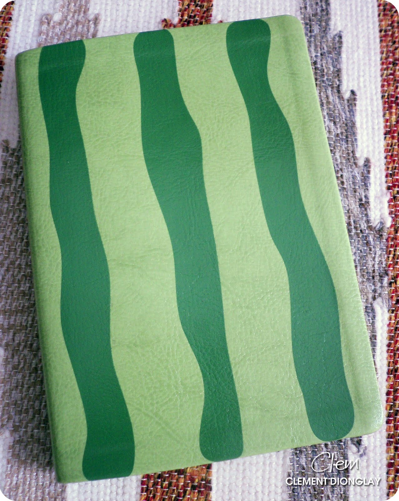

This notebook opens to a wedge of watermelon. You'd want to grab a juicy, wet bite when you see the front and back inside covers are watermelon red with watermelon seeds.


The Watermelon notebook, like the rest of those in Daycraft's Juicy line, have 128 pages of 6.5mm lined cream-colored paper with distinctive 'fruit' designs. The 'fruity' spread below has apples on the lower left of the page and watermelons on the upper right of the page. The 6.5mm spacing is just right for my handwriting.
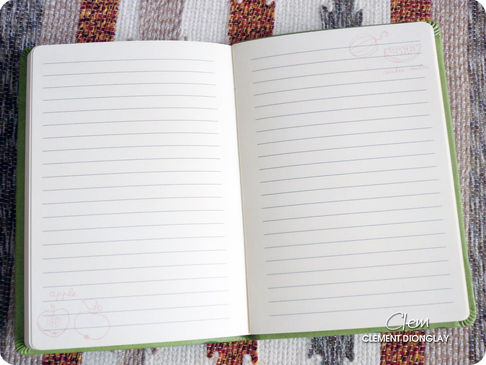


Here's the watermelon design up close. I think the fruit designs are cute. And because they're printed lightly, I can write over them and still read the text I've written. 


The notebook's back cover has the same watermelon rind design as its front cover, but bears the clearly pressed Daycraft logo centered at the bottom.


Like most of Daycraft notebooks, the Juicy line is case bound, so the pages are threaded and glued together to make it durable.
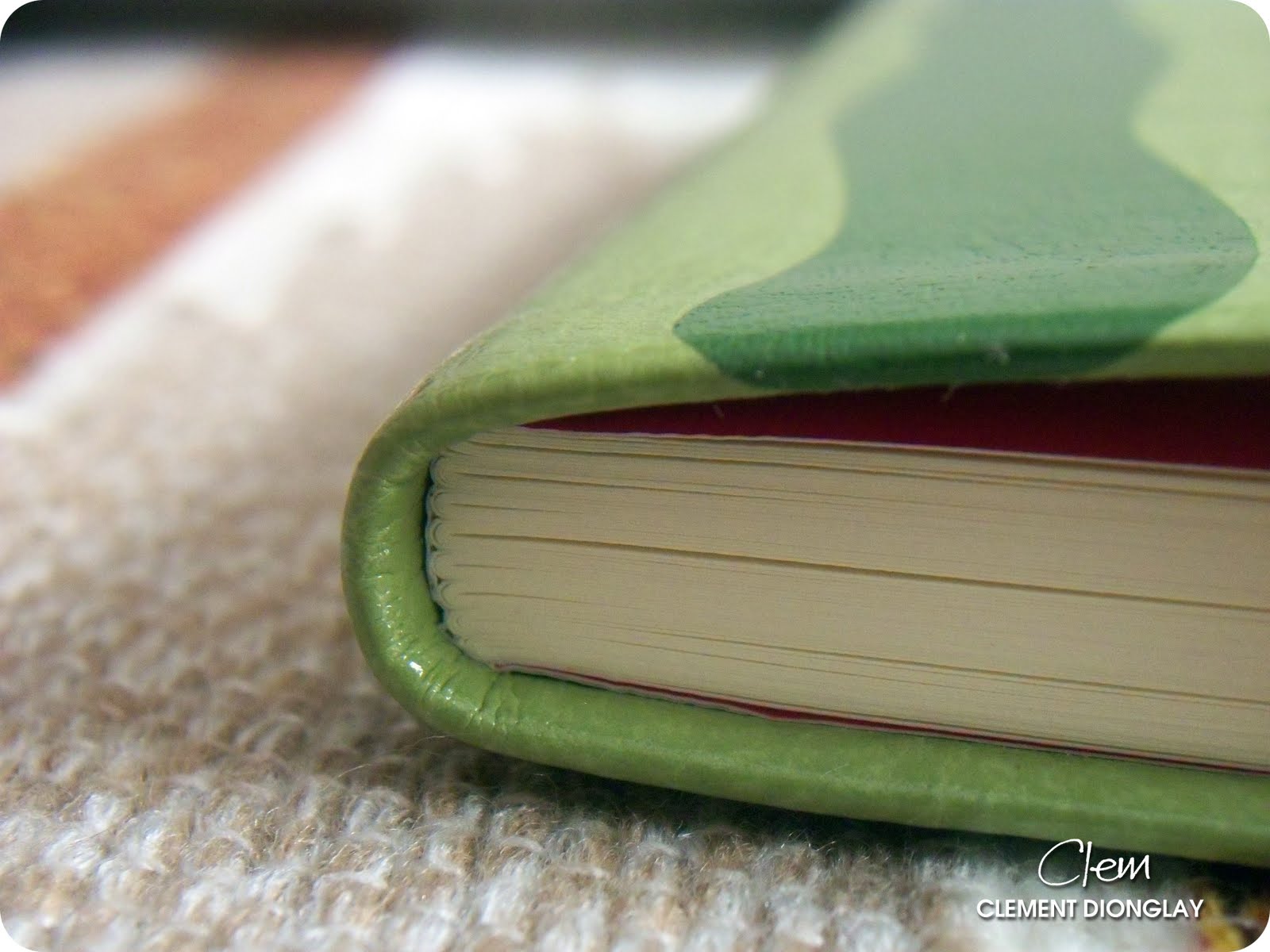

The pages have round corners which I like very much. Pointed/Squared corners are more likely to snag my arm while writing, so the rounded corners are safer and better.


And now the best part of the review is here: pen and ink tests! I always do a number of tests when I have a new notebook. These tests help me choose the best pen and ink combination for any particular notebook. I grouped the tests according to the ink brand this time.


The first page has the ink tests for J. Herbin, Diamine, and Caran d'Ache. There was no feathering on the page and all the inks dried fast. Most of my pens have medium nibs and put large amounts of ink on paper, which is why I am concerned about the inks' drying time. Surpisingly, they all dried fast, including the saturated J. Herbin 1670 Anniversary ink. I'm loving this Juicy Watermelon notebook's paper already. The Herbin inks looked bright and happy, but Diabolo Menthe is the runaway winner here. It looked so beautiful and yet so cool. Diamine Royal Blue appeared so bright that I instantly filled two more pens after seeing it again. And then there's Caran d'Ache Saffron which will always be the perfect orange ink for me.


I tried Private Reserve, Waterman, Pelikan, Noodler's, and Mont Blanc inks on the other page. This time, I saw some feathering in Private Reserve and Noodler's inks, but that's okay as I already expected that. PR Black Magic Blue is a gift from fellow fountain pen collector Karlo Tatad and it surprised me because of its close resemblance to one of my favorite blue inks, Diamine Majestic Blue. Pelikan Blue-Black is another surprise for me because I did not see any feathering even though it's on a BB nib. I also tried two of my Zebra Sarasas here and they looked good on this cream-colored paper.


Below is the back of the first page with ink tests. Note that there is only minimal bleed which is seen only as tiny blue dots. Again, that's okay. This is still way, way better than the first Daycraft notebook I reviewed last year.


The second page revealed more bleed. Private Reserve Avacado on my no-name Maki-e pen is the one bleeding here (on top), as is Noodler's Midnight Blue (lower part of the page).


Here are some macro shots of the inks on the Juicy notebook paper. I was surprised to see under a 10x loupe that the 1670 ink feathered. But Vert Pré did not, and even showed some shading. 


I love the shading that Saffron produced, as well the Blue Sky; and both CdA inks behaved properly: no feathering, no bleed!


After all is said about this excellent little notebook from Daycraft, I realized I forgot to mention that this Watermelon notebook comes with a felt bookmark instead of the usual ribbon pagemarker - cool! It is shaped as a curled stem of the watermelon fruit. Other notebooks in the Daycraft Juicy line have their own respective bookmarks according to their fruit designs.


And what else is good about this notebook? It is sold here in the Philippines at Scribe Writing Essentials! Daycraft notebooks have been available at Scribe's flagship store in Eastwood Mall since last year, and in several PowerBooks outlets this year.

Daycraft products are also widely available now. Aside from Daycraft's distributors, their products can also be bought in stores from these countries: (click on country name to see retail stores) Australia, China, Hong Kong, Indonesia, South Korea, Macau, Poland, Sri Lanka, Taiwan, and Thailand.
Read More
Posted in beautiful things, collecting, Daycraft Juicy Notebook, hobby, notebook, notebook review, paper, pen and ink, reviews | No comments

Monday, 30 May 2011

Ink Review: J. Herbin Diabolo Menthe

Posted on 03:06 by Unknown

In my part of the globe, summer is nearing its end as rains begin to pelt us from tropical storm Bebeng (Aere) and typhoon Chedeng (Songda). But before summer finally bids us farewell and this post becomes a weather alert, let me write my long-postponed review of the one ink that truly reminds me of summer, J. Herbin Diabolo Menthe.

I received this bottle from Marian Ong of Scribe Writing Essentials some time ago and though it wasn't love at first write, I developed a need for it. When I'd write headings and subheadings in my notes, I'd use Diabolo Menthe or Orange Indien. If I need to highlight or underscore my lessons and handouts, I'd use Diabolo Menthe. When I want to impress my nieces with calligraphy, I use Diabolo Menthe.


I understand that not much has been written about this ink, probably because not many fountain pen users find light ink colors suitable for daily, regular writing. Despite this, I find Diabolo Menthe a cool ink color from J. Herbin. It has excellent flow and visible shading especially when used with a wider nib. And though Diabolo Menthe is very light while still wet, it dries a beautiful cyan with highly visible green tones. Diabolo Menthe's tint belongs to the goup of cyan colors including aquamarine, teal, turquoise, and verdigris.

This ink color reminds me of the color the summer seas in Boracay, Anilao, and Puerto Galera.


Here is a macro shot of my poorly drawn Diabolo Menthe icon. I drew the outline with a Platinum brush pen and applied the ink used a q-tip.


The photo below shows excellent shading, which only enhances Diabolo Menthe's tint.


Because of its light color, Diabolo Menthe is perfect for highlighting. I filled my Rotring Artpen with a 2.3 italic nib with it and use it as one of my highlighters. On my white Lamy Safari with a regular medium nib, it's super perfect for underscoring.


Diabolo Menthe is simply incomparable to other turquoise (or light blue) ink colors. The photo below shows that it's not like J. Herbin Bleu Pervenche, Diamine Turquoise, and definitely not like an old favorite, Waterman South Sea Blue. I will not pick a favorite because I love them all, and definitely because Diabolo Menthe is so far away from the rest of the cyan colors.


Lastly, the drying time of Diabolo Menthe is amazing! It dries quickly and nicely. It took less than 15 seconds to dry which works very well when I use it for highlighting.


J. Herbin named Diabolo Menthe after the popular French drink of the same name, which is "simply mint syrup and white lemonade mixed with ice cubes."

(Diabolo Menthe/Green Mint Syrup in Lemonade.
Image from http://mog.com/Anna/blog/163548)


J. Herbin inks are available in 30 beautiful colors. These water-based inks are non-toxic, have neutral pH and manufactured using natural dyes. Download a printable PDF of the J. Herbin fountain pen ink swatches here.

A 30ml bottle of J. Herbin ink sells for P475 at Scribe Writing Essentials, and US$9.50 at The Goulet Pen Company. (I have no affiliation with both companies, though.)
Read More
Posted in 1670 ink, beautiful things, calligraphy, colors, Diabolo Menthe, ink review, J. Herbin | No comments

Tuesday, 27 July 2010

Ink Review: J. Herbin Lierre Sauvage

Posted on 03:30 by Unknown
It rained for four years,
eleven months,
and two days.

The sky crumbled into storms and hurricanes
that scattered roofs 
and knocked down walls
and uprooted every last plant of the banana groves.

- Gabriel García Márquez, 'One Hundred Years of Solitude'


In this part of the world where I live, the dry spell is over, having been banished by the typhoons of the now-officially declared wet season. I like this season of the year - not for the rain and wetness - but because I see green everywhere! What used to be dry, brown spots are now thriving with growth and greens. Now I can walk and run again! Isn't it refreshing to brisk walk after a heavy downpour? It feels so refreshing to be outside when everything has just been washed by the rain.

This may be a surprise because I am known to hate the rain. Well, I do. So I will stop rattling about it and just write about this wonderful J. Herbin green ink from Karen Doherty though Quo Vadis Blog's St. Patrick Day giveaway. And let's hope it doesn't rain for four days, eleven months and two days on this part of the planet. :)  


I received this bottle of J. Herbin Lierre Sauvage in early April, and that gave me enough time to use it before writing this review. I was reluctant to use it at first because green is not an ink color I am usually fond of, but I was so attracted to Lierre Sauvage's hue that I filled my (green) Chelpark Moti pen with it, pronto. And LS did not disappoint. I wrote an entry in my diary with it and I'm happy that it is indeed, a readable green.

I know much has been written about the J. Herbin ink box. I have written as much (read here, here, and here) so I will not do a repeat. But the Herbin bottle, though, is a beauty. Each Herbin bottle has an elegantly designed label and an integrated pen rest as shown in the photo below. I've always complained that the pen rest is too shallow/narrow to fit any regular-sized pen, although my white Unic fits in the groove perfectly, and this slim 1957 Sheaffer cartridge pen fits comfortably; I learned through Brian Goulet (of Goulet Pens Company and Ink Nouveau) that the pen rest is really meant for the Herbin glass dip pens. Now that makes sense. :)


I love playing around with the bottle, so here is another photo with the bottle turned upside down. Doing that shows the embossed print that says "J HERBIN PARIS".


Here's how the ink looks inside the bottle, which is very dark and almost black. But note that the ink on the bottle's neck (below) and walls (see photo above) somehow show the true green color of Lierre Sauvage.


And now the written review. Lierre Sauvage is a moderately saturated ink, that has excellent, consistent, wet flow. Writing is smooth for both round and italic nibs, and shading is seen in both. I enjoyed writing with this ink on my Sheaffer CP and 1.5mm cursive italic Rotring ArtPen. I had no feathering or bleed problems with the Rhodia Reverse notebook paper.


Below are macro shots of several portions of the page above, to further show how Lierre Sauvage behaved on Rhodia paper from two different nibs.

This doodle is written using the Sheaffer CP, which has a medium nib.


Text below was written using the same Sheaffer CP. Notice the evident shading.


Now SKY, taken from the quote was written using the 1.5mm Rotring ArtPen.
I love the clear shading seen here... 


...here...


...and here. In the slanted line of the letter N (and on the lower line of K from the SKY photo), look closely to see that it is subtly divided, made by the separation of the nib tines.


Lierre Sauvage is a green ink with traces of yellow, or orange, which contributes to its brightness. In the photo below, it is clear that this bright (but not neon-bright) readable green ink shows more yellow than blue (like Diamine Woodland Green - that's for the next ink review), black (like Private Reserve Avacado, my first green ink which I use sparingly due to its saturation), or gray (like the vintage, made in the Philippines Parker Super Quink Permanent Green).


Lierre Sauvage dries fast enough. After the 15th second, it has completely dried on paper, including the dots and end points of strokes. I did not do a comparison with the other green inks, though. 


Lierre Sauvage borrows its green hue and icon from the wild ivy, which is its direct translation. I am loving it, and currently has three pens on my pen wrap inked with it.

J. Herbin inks are available in 30 beautiful colors. These water-based inks are non-toxic, have neutral pH and manufactured using natural dyes. Dowload a printable PDF of the J. Herbin fountain pen ink swatches here.

A 30ml bottle of J. Herbin ink sells for P475 at Scribe Writing Essentials, and US$9.50 at The Goulet Pen Company. (I have no affiliation with either companies, though.)

J. Herbin Lierre Sauvage ink used in this review courtesy of Exaclair, Inc. through Karen Doherty and Rhodia Reverse Notebook from fellow fountain pen collector and budding business entrpreneur John Raymond Lim. The two pens used, the Rotring ArtPen and Sheaffer CP both belong to my collection.
Read More
Posted in beautiful things, calligraphy, handwriting, ink review, J. Herbin, Lierre Sauvage, Rhodia, Rotring, Sheaffer | No comments

Tuesday, 22 June 2010

If You Forget Me by Pablo Neruda

Posted on 08:00 by Unknown
I love poetry. I've always have. In high school, I liked Christina Georgina Rosetti, and later in college, I devoured Sylvia Plath. A few years back, I read about the Italian film 'Il Postino', a fictional story about real-life poet Pablo Neruda. I was unlucky in my search for a copy to watch, so I consoled myself with the incomplete sountrack I received from a friend. Aside from the film's score, the soundtrack also includes Pablo Neruda's poems being recited by various artists including Madonna, who recited this lovely poem.

If You Forget Me1

I've said that I'm new into calligraphy, and Chancery is the only form I could do now. I rendered the poem using four cursive italic calligraphy pens, inked with four different inks on a Rhodia Metallic Reverse notebook. I did this at 2 in the morning last Saturday, to loosen up after reviewing for my exam later that morning on Cross-Cultural Communication.

First page, photo above. For the title and second paragraph, I used my Sheaffer NoNonsense pen with a fine italic nib filled with Diamine Burnt Sienna. The first paragraph was written using a Lamy Vista with a 1.5mm italic nib, inked with J. Herbin Rouille d'Ancre.

If You Forget Me2

Second, page, photo above. I used a Lamy Joy with a 1.9mm italic nib inked with Diamine Chocolate for the first paragraph, and a Rotring Art Pen with a 1.5mm italic nib inked with J. Herbin Lierre Sauvage. Love these colors!

Below are photos of the last paragraphs of both pages. These are very poignant words. And though they may come across as words directed towards someone's lover, they are actually Neruda's expression of love for his country, Chile.

If You Forget Me3

Inks behave differently in different pens on different paper stocks. If Diamine Burnt Sienna is on any of my Parkers, it writes very pale brown strokes. On the Sheaffer NN, it's marvelous! The classy, lovely rust-brown color is amazing! It has excellent shading, too. This paragraph reminds me a lot of Alanis Morissette's You Oughta Know.

If You Forget Me4

This green is J. Herbin Lierre Sauvage, the ink I got from Exaclair's/Quo Vadis' Saint Patrick's Giveaway. I am not a fan of green inks, but I love this one! Excellent shading, excellent flow, great color!

The J. Herbin inks used in this review are courtesy of Karen Doherty, Marketing VP of Exaclair; while the Rhodia Metallic Reverse notebook is from the FPN-P May pen meet raffle. The Diamine Burnt Sienna and all the pens used belong to The Archer.
Read More
Posted in beautiful things, calligraphy, handwriting, poetry | No comments
Older Posts Home
Subscribe to: Posts (Atom)

Popular Posts

  • Notebook Review: Clairefontaine Basics Clothbound Notebook
    When I received the package that Karen Doherty of Exaclair sent me in September, I liked everything in it except a black, plain notebook. ...
  • Pen Review: Schneider iD Fountain Pen
    I love Schneider pens. I have a huuuge stash of Schneider gel pens, fineliners, and rollerballs hoarded collected before I shifted to fou...
  • Ink Review: J. Herbin 1670 Ink
    Red was your colour. If not red, then white. But red Was what you wrapped around you. Blood-red. Was it blood? Was it red-ochre, for warming...
  • Review: Unlimited Notebook by Rhodia
    When I received these Rhodia UNLIMITED notebooks that Karen Doherty sent to me last year, I asked her why they're called UNLIMITED. Kar...
  • Fountain Pen Review: Lamy Safari 2012 Limited Edition Green
    When I started using fountain pens in 2007, I was like any other newbie. I hoarded. I had no clear idea of what I really want and got pens I...
  • Ink Review: Sailor Jentle Grenade
    O drops of me! trickle, slow drops, candid, from me falling — drip, bleeding drops, ~ From "Trickle, Drops" by Walt Whitman One of...
  • Fountain Pen Review: Sheaffer Taranis
    Sheaffer celebrates their Centennial Year - 2013 - with a fleet of writing instruments including super limited edition pens and two new seri...
  • Oh, No...
    Oh, no. Not him, please... Actor Morgan Freeman is injured in car accident.
  • For Winter, Let's Have Cold Horizon
    (Courtesy of Bryan Bedell /  fieldnotesbrand.com ) And Field Notes has done it again. Wow me with their notebooks, that is. 2013's Wint...
  • An Idea Gone Wild and Wilder Gets Scrapped
    It is quite obvious that the last two months of my life is far from blissful. I really do not know for sure how I get by. People may shun me...

Categories

  • 1670 ink
  • 2012 Green
  • 2046
  • Aboitiz 2Go
  • Activebook
  • Agatha Ruiz de la Prada
  • Alice Wu
  • Ambre de Birmanie
  • Andy Garcia
  • aneurysm
  • Apple
  • Apple Green
  • Aquamarine Lamy Safari
  • Arthur Golden
  • asthma
  • Aurora
  • Aurora Blue
  • AV malformation
  • Banditapple Carnets
  • Bandzug
  • Baoer
  • beautiful things
  • Beijing Olympics souvenir
  • Bejewelled
  • Bench
  • Berroca
  • Binondo
  • birthdays
  • black
  • Bleu Pervenche
  • Blistex
  • blog advertising
  • blogging
  • blue
  • blue inks
  • blue notebooks
  • Body Shop
  • Books
  • Brause
  • Bridges of Madison County
  • broad
  • broad nibs
  • calligraphy
  • Camel Scarlet Red
  • Camlin Trinity
  • Caramoan
  • Caran d'Ache
  • Caran d'Ache Saffron
  • Cararama
  • Carnival of Pen Pencil and Paper
  • cars
  • Cattleya
  • Chelpark Moti
  • ChoroQ
  • Christmas
  • Chuck Taylor
  • Clairefontaine
  • Clint Eastwood
  • coffee
  • Coleto
  • Colibri
  • collecting
  • colors
  • Corgi
  • Corona notebooks
  • Cosmos Bazaar
  • Creative Zen
  • Cross
  • Daiso
  • Danitrio
  • Daycraft Juicy Notebook
  • Daycraft Notebook
  • Daycraft Signature
  • Daycraft Signature Notebook
  • De Atramentis
  • Diabolo Menthe
  • Diamine
  • Diamine Majestic Blue
  • Diamine Orange
  • Diana Krall
  • Diary
  • Dickies
  • Diesel
  • DKNY
  • dotPad
  • Eagle notebooks
  • Earl Grey
  • eBay
  • Edelstein
  • Effen Vodka
  • elephant
  • elephants
  • envelope
  • Esterbrook
  • Euro Office
  • Evanescence
  • Exaclair
  • Exacompta
  • ferris wheel
  • Field Notes
  • fire trucks
  • firetrucks
  • folder
  • food
  • Foray
  • fountain pen
  • fountain pen ink
  • fountain pen review
  • fountain pens
  • FPN-P
  • Frank
  • Fully Booked
  • G. Lalo
  • garage
  • gel pens
  • get paid to blog
  • GPW
  • Grandluxe
  • grassheads
  • Green
  • grid notebook
  • GTD
  • handwriting
  • Haolilai
  • Hard Rock
  • Haruki Murakami
  • health
  • hearbreak
  • heartbreak
  • Hero 221
  • Hero pens
  • Hero616
  • hobby
  • Ikea
  • Il Divo
  • ink
  • ink review
  • inks
  • Inoxcrom
  • iPaq
  • iPod mini
  • iron gall ink
  • J. Herbin
  • J. Herbin Rouille d'Ancré
  • James Blunt
  • James Patterson
  • Japanese ink
  • Jentle
  • Jinhao
  • Joan Chen
  • Jollibee
  • Journal
  • Kaj Stenvall
  • Karen Doherty
  • Kokuyo
  • Kramer vs. Kramer
  • Kultur
  • LA Gear
  • Laban
  • Lamy
  • Lamy Al-Star
  • Lamy Blue Black
  • Lamy Joy
  • Lamy Logo
  • Lamy Nexx
  • Lamy Safari
  • Lamy Safari Neon
  • Larmes de Cassis
  • leather
  • Lee
  • lesbianism
  • Lierre Sauvage
  • life
  • Limited Edition
  • lined notebook
  • lip gloss
  • love
  • Lynn Chen
  • Lyons
  • Mahatma Gandhi
  • Maisto
  • Majestic Blue
  • Manila
  • Manuscript
  • Master
  • Matchbox
  • Memoirs of A Geisha
  • Mesaki
  • Miami Ink
  • Michael Jackson
  • Michelle Krusiec
  • Midori
  • Midori Traveler's Notebook
  • migraine
  • Moleskine
  • MonAmi
  • Mont Blanc
  • Moore
  • Movies
  • MRA
  • MRI
  • Music
  • NaNoWriMo
  • National Bookstore
  • neon
  • new product
  • nib
  • nibs
  • Nike
  • Nokia
  • Noodler's
  • Noodlers
  • Norah Jones
  • notebook
  • notebook review
  • notebooks
  • notepad
  • novels
  • office stationery
  • office supplies
  • orange
  • Orange Indien
  • Osmiroid
  • Oxblood
  • Pablo Neruda
  • paper
  • paper review
  • Parker
  • Parker Penman
  • Parker Quink
  • Parker Rialto
  • Paulo Coelho
  • Pelikan
  • Pelikano Junior
  • pen and ink
  • pen holder
  • pen holders
  • pen review
  • pencils
  • Penman inks
  • pens
  • perfume
  • Phillips
  • Pilot 78G
  • Pilot Coleto
  • Pilot FriXion Ball
  • Pilot G2
  • Pilot GTEC
  • Pilot H32 mechanical pencil
  • Pilot pens
  • Pilot Petit
  • pink
  • planner
  • Platignum
  • Platinum Preppy
  • pocket notebook
  • poetry
  • police cars
  • polyurethane
  • Poppin
  • postcards
  • Postcrossing
  • Poussière de Lune
  • Private Reserve
  • Private Reserve Avacado
  • Private Reserve Copper Burst
  • product review
  • Pukka
  • Quiver
  • Quo Vadis
  • Quo Vadis Habana
  • reading
  • red
  • Red Dragon
  • red ink
  • reecovid
  • Retro 51
  • review
  • reviews
  • Rhodia
  • Ricky Martin
  • RJ100
  • Robert James Waller
  • Rocket Dog
  • Rotring
  • Rouge Opera
  • round corner
  • Safari
  • Saffron
  • Sailor
  • Samsung
  • San Francisco Bridge
  • Saving Face
  • scented inks
  • Schneider Base
  • Schneider iD
  • Schneider pens
  • Scribe
  • Scribe Writing Essentials
  • Scriptmaster II Series Mary Ann
  • Sharpie
  • Sheaffer
  • Sheaffer Taranis
  • shopping cart
  • shotglass
  • shotglasses
  • Siku
  • Simpsons
  • sleep
  • Somersby
  • Songs
  • Sony Ericsson
  • Staedtler
  • stamps
  • Starbucks
  • Sterling notebooks
  • Stradmore
  • stub nibs
  • stubs
  • Stypen
  • Symbicort
  • Syrah
  • Taranis
  • Tazo
  • Terre de Feu
  • Text Twist
  • The Archer
  • The Burns Sisters
  • The Graduate
  • The L Word
  • thyroidectomy
  • Timbuk2
  • TOMICA
  • TOMY
  • toy trucks
  • toys
  • turquoise
  • TWSBI
  • TWSBI notebook
  • typhoon
  • Uni-Ball
  • Uni-Ball Signo Gelstick
  • Ventolin
  • Visconti
  • Wality
  • water resistance test
  • Waterman
  • Waterman South Sea Blue
  • white fountain pens
  • Whitelines
  • Wong Kar Wai
  • Write-Now
  • writing
  • yellow
  • Youth pens
  • Zebra Jimnie
  • Zippi

Blog Archive

  • ▼  2013 (10)
    • ▼  November (1)
      • For Winter, Let's Have Cold Horizon
    • ►  September (1)
    • ►  June (2)
    • ►  May (1)
    • ►  April (1)
    • ►  March (1)
    • ►  February (3)
  • ►  2012 (5)
    • ►  November (1)
    • ►  June (2)
    • ►  February (1)
    • ►  January (1)
  • ►  2011 (16)
    • ►  December (1)
    • ►  November (1)
    • ►  October (2)
    • ►  August (3)
    • ►  July (1)
    • ►  June (2)
    • ►  May (1)
    • ►  April (2)
    • ►  February (1)
    • ►  January (2)
  • ►  2010 (17)
    • ►  November (2)
    • ►  August (3)
    • ►  July (1)
    • ►  June (2)
    • ►  May (1)
    • ►  April (1)
    • ►  March (3)
    • ►  February (3)
    • ►  January (1)
  • ►  2009 (51)
    • ►  December (1)
    • ►  November (1)
    • ►  October (7)
    • ►  September (3)
    • ►  August (5)
    • ►  July (5)
    • ►  June (6)
    • ►  May (5)
    • ►  April (6)
    • ►  March (3)
    • ►  February (6)
    • ►  January (3)
  • ►  2008 (107)
    • ►  December (1)
    • ►  November (5)
    • ►  October (4)
    • ►  September (14)
    • ►  August (10)
    • ►  July (21)
    • ►  June (10)
    • ►  May (4)
    • ►  April (9)
    • ►  March (10)
    • ►  February (12)
    • ►  January (7)
  • ►  2007 (48)
    • ►  December (1)
    • ►  November (3)
    • ►  October (9)
    • ►  September (10)
    • ►  August (3)
    • ►  June (6)
    • ►  May (4)
    • ►  April (3)
    • ►  March (3)
    • ►  February (5)
    • ►  January (1)
  • ►  2006 (6)
    • ►  August (6)
Powered by Blogger.

About Me

Unknown
View my complete profile