Tuesday, 30 November 2010

Notebook Review: Daycraft's Flower Wow


I'm always happy to receive new products to review, especially ink and paper. When Foreal Lee of Daycraft/Tai Shing Diary Ltd. emailed me to ask if I am interested to review their new notebooks, I replied with a fast-as-lightning yes! A week later, DHL delivered a box to my office with the notebooks that Foreal sent. It felt like Christmas morning in August.

Among the notebooks that Foreal sent to me is one of Daycraft's new products, Flower Wow notebook, the one that Daycraft won't claim (but won't rule out, either) as the world's most beautiful notebook. Available in one size (6 in x 8.5 in) and four cover designs, Flower Wow notebooks have real fabric cover with illustrations of stunning colorful bouquets. My notebook has large, beautiful red and pink blooms on the white fabric cover, which according to Daycraft is a special type of printable cloth from The Netherlands.

Flower Wow notebook. Lovely flowers on the front cover...

 
A closer look at the big red flower on the cover.

A smaller flower is printed on the back cover...

 ... that also bears the Daycraft logo, printed in gold. Elegant.


The gold inside cover of this notebook and the colorful blooms on the inside pocket add more elegance to it. 

The Flower Wow notebook has 176 pages of smooth, cream-colored 116g paper. As with my other Daycraft notebooks, I like that it is ruled, and the 6.5mm line spacing is just right for my large handwriting. Consistent with the notebook's theme, the pages are ruled with faint lines in gold.

The spread of the notebook's inside pages shows printed illustrations of flowers on both the lower right and upper left corners.

Flowers on the notebook's pages. 

The edge of the Flower Wow notebook is gilted in gold - this feature, together with the flower prints on the pages, fabric cover, and gold inside cover, makes me wonder if this notebook came from Victorian times.


I tested quite a number of ink colors and fountain pens on the Flower Wow notebook, and though some ink types feathered and bled, there is definitely a great improvement in Daycraft's paper quality in terms of fountain pen and ink friendliness. This is definitely a lot different than the paper quality of the Signature notebook I reviewed last February.


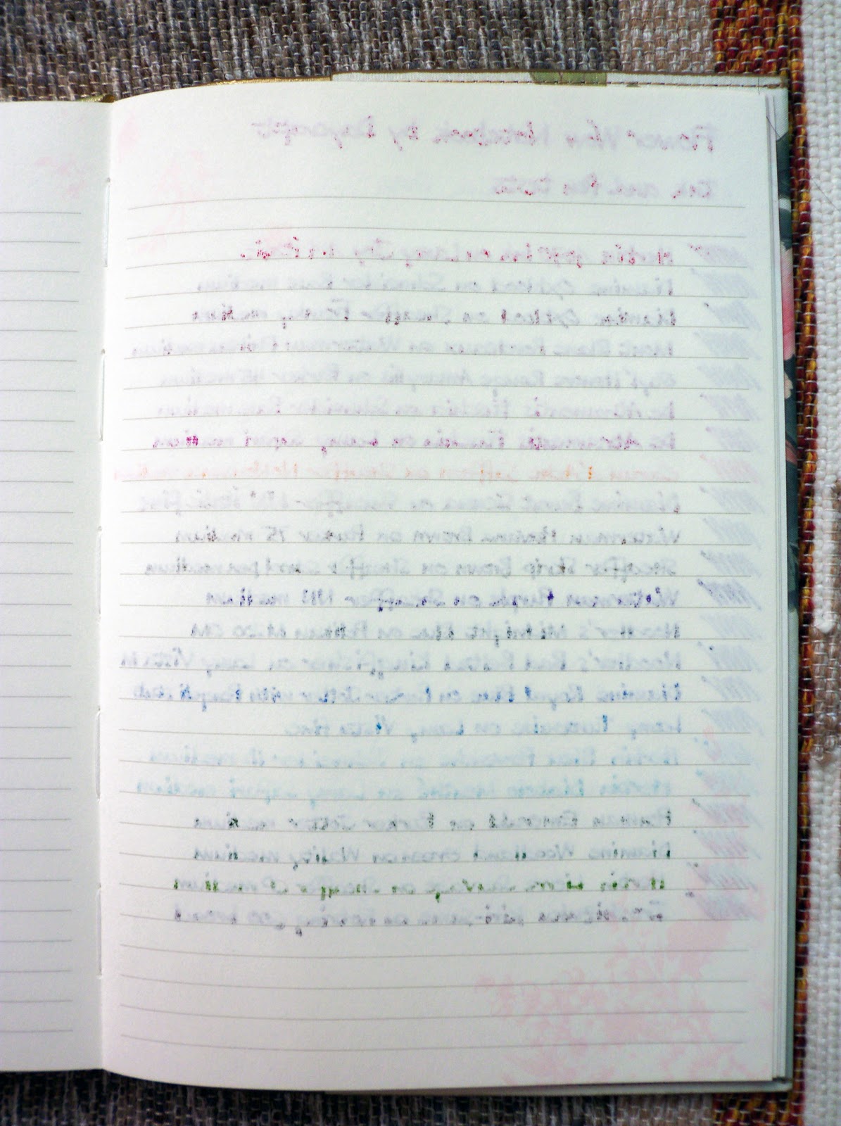
Some inks bled (see photo below), but I'll have to consider the fact that I used mostly medium wet nibs, so both feathering and bleed are hard to avoid. I'm suprised though, that some pen and ink combinations wrote so well without bleed. These are: Waterman Phileas (M) with Mont Blanc Bordeaux (line 4), Parker 45 (M) with Styl' Honore Rouge Amaryllis (line 5), Schneider Base (M) with De Atramentis Fuschia, (line 6), Sheaffer NoNonsense (M) with Caran d'Ache Saffron (line 8), Sheaffer NoNonsense (fine italic) with Diamine Burnt Sienna (line 9), Schneider iD (M) with J. Herbin Bleu Pervenche (line 17), and Lamy Safari (M) with J. Herbin Diabolo Menthé.

The other side of the test page. Some inks bled. Some are just right. Which means I can use this notebook with my fountain pens. For journalling. Then I'd feel like a lady from the courts of Victoria writing about hard work, perseverance, love and luck.

Below are some macro shots of some of the ink colors on the Flower Wow notebook:

Noodler's Midnight Blue

Noodler's Bad Belted Kingfisher

Diamine Oxblood

J. Herbin Bleu Pervenche

Irozhizuku Kiri-same

Waterman Havana Brown

De Atramentis Fuschia

Caran d'Ache Saffron

Mont Blanc Bordeaux

The Flower Wow notebook is another great addition to the beautiful products of Daycraft. I am glad, as well as other Pinoy pen and paper enthusiasts to know that Mr. Foreal Lee, Retail and Marketing Manager of Tai Shing Diary, makers of Daycraft noteboks, have facilitated the availability of their products here in the Philippines.

Daycraft products such as diaries, notebooks, and sketchbooks are available at Scribe Writing Essentials located at Eastwood Mall, Libis, Quezon City.

Thursday, 4 November 2010

Ink Review: J. Herbin 1670 Ink

Red was your colour.
If not red, then white. But red
Was what you wrapped around you.
Blood-red. Was it blood?
Was it red-ochre, for warming the dead?
Haematite to make immortal
The precious heirloom bones, the family bones.

- Ted Hughes, 'Red'


Karen Doherty, Exaclair's Marketing VP, surprised me with a box last September. It was completely unexpected, and I jumped like a little kid when I saw the 1670 Anniversary ink, a large Rhodia dotPad, and an anise green blank Habana inside the box all swathed in seemingly endless piece of bubble wrap. I felt very lucky to receive a bottle of this ink because it is a limited edition ink, released early this year to specifically commemorate J. Herbin's 340th founding anniversary.

The J. Herbin Anniversary ink is named 1670 after the year the company was founded. It is also called Rouge Hematite for its color, taken after the mineral hematite (blood ore), which is also the Greek word for blood.


I like the unique design and packaging of this ink. Unlike the other J. Herbin inks, the 1670 Anniversary ink arrived in a new bottle inside a new box. The 1670 comes in square 50ml bottles, with 1670 simply embossed on gold wax to tell its name.


The 1670 Anniversary ink's clear square bottle reminds me a lot of Caran d'Ache ink bottles, but the gold string on the bottle's neck caught under the gold sealing wax (which Stephanie of Biffybeans blog wrote as glue gun wax) adds a touch of elegance into its simplicity.


The gold wax on the bottle, according to the J. Herbin website, is "reminiscent of the wax used for the 'grand cru' wines of France," and all gold wax seals on all 1670 ink bottles are handmade. PaperAndCo.com has a video of this process and it's amusing to see how it's being done: the person assigned to this task puts the gold string on the bottle's neck, pumps the glue gun wax onto the gold string and the bottle, stamps the 1670 on the glue gun wax, cuts the gold string to desired length, and does the whole process again. Cool!


The red wax on the ink bottle's cap is made of official wax cherry, and strongly reminds me of the wax used in cheeses, especially the big queso de bola (Edam cheese) we see in supermarkets around Christmas time here, and get either as gifts from friends or as part of our Christmas grocery package. According to the inital set of reviews, the red wax used for the earlier batch of inks was brittle and crumbled easily, but I received a newer version with a more flexible wax. But all the same, I am very careful when I cap and uncap the bottle. I don't want to destroy the beauty of this ink yet. 


This ink's bottle cap is made of aluminum, and I wished they used the usual hard plastic caps. Then again, wax may not stick to the plastic very well, and so they decided to use aluminum.


The 1670's box is another J. Herbin work of wonder. It has been carefully designed to represent the life of J. Herbin, who was a sailor. The ship, anchor and palm tree represent navigation and discovery; while the crown is a reference to the red sealing wax color used in the royal courts of Europe.

-----------------------------------


Rouge Hematite is a unique ink color in the red/orange/brown range, which is my favorite. It has an intense, vibrant, earthy and blood-red color that is reminiscent of the historical J. Herbin logo and the sealing wax used in the royal courts of previous eras.
 
The 1670 ink has the same qualities of J. Herbin inks I have tried in the past. It has smooth flow, good lubrication, shading and of course, excellent color. However, it is very, very saturated compared to other J. Herbin inks.

For a larger photo click here.

I used a Rotring ArtPen with 1.5 italic nib for the calligraphy, and my white Schneider Base with a firm medium nib for my written review. The grid notebook is from Saizen, which took the inking very well. There is no feathering and bleed for both of the pens I used. Notice the difference in color and shading for the two pens.


The poem I wrote using the 1.5 italic nib looks a brighter red, with more evident orange hues.


The text I wrote using the medium nib looks a darker red, though.

-----------------------------------


And now here are some macro shots. I hope the images below captured the gold in the letters I wrote, especially where more ink was placed on paper.  


Below is the 1670 ink in comparison with other red inks: Diamine Poppy Red (dries a bright red), Camel Scarlet Red (dries a pinkish red), Parker Super Quink Red (dries a pale red), J. Herbin Rouge Opera (not a true red, but dries a beautiful rose red), and Diamine Oxblood (a dark, dark blood-red color). The 1670 ink is the stand-out color in the group, its reddish somewhat brownish-earthy-golden color is a winner!


I mentioned earlier that the 1670 ink is a highly saturated ink. This may be a problem among left-hand writers because this property makes it such a slow-drying ink. I used the Base pen on Rhodia paper for this test, and though several factors may have contributed to drying time, the 1670 is undeniably a slow-drying ink to be 'almost dry' at 1 minute 30 seconds.


I tried writing with the 1670 ink on different papers from several notebooks I got. Below are several pictures of them.


I am so in love with this ink I have been using it on three different pens since I got it. I love the color, shading and the tiny gold flecks I see when I look closely at the dried ink on paper. But this is a limited edition ink, said to be produced only this year, and I hope that J. Herbin will include this ink into their regular production.

Aside from the 1670 Anniversary ink, J. Herbin also offers 30 more inks in beautiful colors. These water-based inks are non-toxic, have neutral pH and manufactured using natural dyes. Dowload a printable PDF of the J. Herbin fountain pen ink swatches here.

A 50ml bottle of the 1670 Anniversary ink sells for US$20 at the Goulet Pen Company, and will soon be available at Scribe Writing Essentials here in the Philippines. (I have no affiliation with either companies, though.)

The 1670 Anniversary ink used in this review is courtesy of Exaclair, Inc. through Karen Doherty, as well as the Rhodia pad. Daycraft notebook courtesy of Foreal Lee of Daycraft, and Reecovid notepad courtesy of Ingrid Savill of Reecovid. The Pukka notebook and two pens used in this review all belong to my personal collection.